

1. LINE GRAPH QUESTIONS - IELTS PAST PAPERS & SAMPLE PAPERS WRITING TASK 1 LINE GRAPH
July 1,2025
root
The graph below shows the amounts of waste produced by three companies over a period of 15 years.
Summarise the information by selecting and reporting the main features, and make comparisons where relevant.

MODEL ANSWER:
The line graph compares three companies in terms of their waste output between the years 2000 and 2015.
It is clear that there were significant changes in the amounts of waste produced by all three companies shown on the graph. While companies A and B saw waste output fall over the 15-year period, the amount of waste produced by company C increased considerably.
In 2000, company A produced 12 tonnes of waste, while companies B and C produced around 8 tonnes and 4 tonnes of waste material respectively. Over the following 5 years, the waste output of companies B and C rose by around 2 tonnes, but the figure for company A fell by approximately 1 tonne.
From 2005 to 2015, company A cut waste production by roughly 3 tonnes, and company B reduced its waste by around 7 tonnes. By contrast, company C saw an increase in waste production of approximately 4 tonnes over the same 10-year period. By 2015, company C’s waste output had risen to 10 tonnes, while the respective amounts of waste from companies A and B had dropped to 8 tonnes and only 3 tonnes.
(190 words, band 9)
The first chart below gives information about the money spent by British parents on their children’s sports between 2008 and 2014. The second chart shows the number of children who participated in three sports in Britain over the same time period.
Summarise the information by selecting and reporting the main features, and make comparisons where relevant.
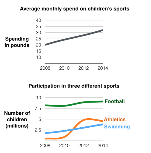
MODEL ANSWER:
The line graphs show the average monthly amount that parents in Britain spent on their children’s sporting activities and the number of British children who took part in three different sports from 2008 to 2014.
It is clear that parents spent more money each year on their children’s participation in sports over the six-year period. In terms of the number of children taking part, football was significantly more popular than athletics and swimming.
In 2008, British parents spent an average of around £20 per month on their children’s sporting activities. Parents’ spending on children’s sports increased gradually over the following six years, and by 2014 the average monthly amount had risen to just over £30.
Looking at participation numbers, in 2008 approximately 8 million British children played football, while only 2 million children were enrolled in swimming clubs and less than 1 million practised athletics. The figures for football participation remained relatively stable over the following 6 years. By contrast, participation in swimming almost doubled, to nearly 4 million children, and there was a near fivefold increase in the number of children doing athletics.
(184 words, band 9)
The line graph show internet users as percentage of population.
Summarise the information by selecting and reporting the main features, and make comparisons where relevant.

MODEL ANSWER:
The line graph compares the percentage of people in three countries who used the Internet between 1999 and 2009.
It is clear that the proportion of the population who used the Internet increased in each country over the period shown. Overall, a much larger percentage of Canadians and Americans had access to the Internet in comparison with Mexicans, and Canada experienced the fastest growth in Internet usage.
In 1999, the proportion of people using the Internet in the USA was about 20%. The figures for Canada and Mexico were lower, at about 10% and 5% respectively. In 2005, Internet usage in both the USA and Canada rose to around 70% of the population, while the figure for Mexico reached just over 25%.
By 2009, the percentage of Internet users was highest in Canada. Almost 100% of Canadians used the Internet, compared to about 80% of Americans and only 40% of Mexicans.
(151 words)
The graph below shows the unemployment rates in the US and Japan between March 1993 and March 1999. Write a report for a university lecturer describing the information shown below. You should write at least 150 words.

(Cambridge 3 – TEST 4)
A CANDIDATE’S ANSWER:
This is an answer written by a candidate who achieved a Band 7 score. Here is the examiner’s comment:
“This is a good account of the information presented in the graph, although occasionally the organisation of the data is slightly unusual. The writer grasps all the key points, however, and supports these with figures, before providing a summary of the main points. Sentence structures are more than adequate, although the writer has some problems with the use of tenses and prepositions. There are minor examples of unsuitable register (e.g. ‘turned out’, ‘disastrous’, and one contracted verb form), but as there are only a few instances of this, the candidate has not been penalised.”
According to the results of the labour-force research published recently, the following conclusions can be drawn from it:
In March, 1993, United States had seven percent of their workforce which might not seem disastrous until compared with Japan, where 2.5% were unemployed. However, the unemployment rate in United States began declining slowly since March 1993, and reached 5% mark in the middle of 1996. Japan turned out to be less lucky, as their unemployment rate doubled in three years. From then on. the percentage of unemployed workforce in United States remained roughly the same — about 5% until March 99, although there were minor falls and rises in the unemployment rate.
As for Japan, the percentage of unemployed fell rapidly by 0.5—0.6% after March 1996, but from summer 1996 and onwards it grew steadily and without any falls to reach 5.0% boundary in March 1999.
The major conclusion that I’ve drawn using the graph, is that number of unemployed in USA decreased by about 2.0% in the course of six years, while in Japan it actually increased by 2.5% percent. As a result, in March 99, both Japan and US had about 5% of their work force unemployed.
(198 words)
The graph below shows the unemployment rates in the US and Japan between March 1993 and March 1999. Write a report for a university lecturer describing the information shown below. You should write at least 150 words.

(Cambridge 5 – TEST 1)
REFERENCE ANSWER:
This model has been prepared by an examiner as an example of a very good answer. However, please note that this is just one example out of many possible approaches
The graph shows the increase in the ageing population in Japan, Sweden and the USA. It indicates that the percentage of elderly people in all three countries is expected to increase to almost 25% of the respective populations by the year 2040
In 1940 the proportion of people aged 65 or more stood at only 5% in Japan, approximately 7% in Sweden and 9% in the US. However, while the figures for the Western countries grew to about 15% in around 1990, the figures for Japan dipped to only 2.5% for much of this period before rising to almost 5% again at the present time
In spite of some fluctuation in the expected percentages, the proportion of older people will probably continue to increase in the next two decades in the three countries. A more dramatic rise is predicted between 2030 and 2040 in Japan, by which time it is thought that the proportion of elderly people will be similar in the three countries.
(164 words)
The graph below shows the consumption of fish and name different kinds of meat in a European country between 1979 and 2004.
Summarise the information by selecting and reporting the main features, and make comparisons where relevant.

(Cambridge 7 – TEST 2)
REFERENCE ANSWER:
This model has been prepared by an examiner as an example of a very good answer. However, please note that this is just one example out of many possible approaches
The graph illustrates changes in the amounts of beef, lamb, chicken and fish consumed in a particular European country between 1979 and 2004.
In 1979 beef was by far the most popular of these foods, with about 225 grams consumed per person per week. Lamb and chicken were eaten in similar quantities (around 150 grams), while much less fish was consumed (just over 50 grams).
However, during this 25-year period the consumption of beef and lamb fell dramatically to approximately 100 grains and 55 grams respectively. The consumption of fish also declined, but much less significantly to just below 50 grams, so although it remained the least popular food, consumption levels were the most stable. The consumption of chicken, on the other hand, showed an upward trend, overtaking that of Iamb in 1980 and that of beef in 1989. By 2004 it had soared to almost 250 grams per person per week.
Overall, the graph shows how the consumption of chicken increased dramatically while the popularity of these other foods decreased over the period.
(174 words)
The graph below shows the quantities of goods transported in the UK between 1974 and 2002 by four different modes of transport.
Summarise the information by selecting and reporting the main features, and make comparisons where relevant.
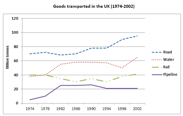
(Cambridge 8 – TEST 4)
A CANDIDATE’S ANSWER:
This is an answer written by a candidate who achieved a Band 8 score. Here is the examiner’s comment:
This answer covers all the relevant information in the task, and clearly highlights the main trends and comparison. The only thing that would improve this answer is an introduction to the topic that is not so closely copied from the prompt.
The message is easy to follow because paragraphing is logical, and information is clearly linked across the whole answer. A wide range of vocabulary is used accurately and effectively, although there are some rare imprecise choices and some repetitions. Similarly, a wide range of grammatical structures and sentence forms is used accurately and effectively, with only one significant error where punctuation is omitted in the final paragraph. Overall, most sentences are accurate.
The line graph illustrates the quantities of goods transported in the United Kingdom by four different models of transport between the time period of 1974 and 2002. Over this span of 28 years, the quantities of goods transported by road, water and pipeline have all increased while the quality transported by rail has remained almost constant at about 40 million tones.
The largest quantity of goods transported both in 1974 and 2002 was by road (70 million tonnes and 98 million tonnes respectively) while the lowest both in 1974 and 2002 was by pipeline (about 5 million tonnes and 22 million tonnes respectively). The amount of goods transported by water was constant from 1974 to 1978, where it showed an exponential growth, rising to almost 60 million tonnes after which it plateaued for about 20 years before starting to rise gradually again.
The amount of goods transported by rail is almost constant at 40 million tonnes in 1974 and 2002, with decrease in quantity in between the years. It is also interesting to note the almost all showed a decrease in 1994 in amount of goods transported except for the pipeline, which actually peaked in that year.
In conclusion, the road remains the most popular method of transporting goods in the UK while water and pipelines are becoming increasingly used, have not become more popular as a method of transport.
(230 words)
The graph below gives information from 1 2008 report about consumption of energy in the USA since 1980 with projections until 2030.
Summarise the information by selecting and reporting the main features, and make comparisons where relevant.
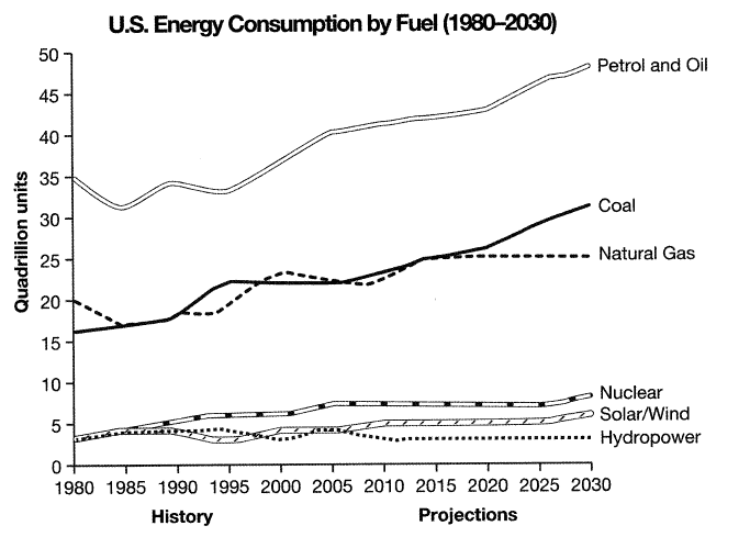
(Cambridge 9 – TEST 4)
REFERENCE ANSWER:
This model has been prepared by an examiner as an example of a very good answer. However, please note that this is just one example out of many possible approaches.
The graph shows energy consumption in the US from 1980 to 2012 and projected consumption to 2030.
Petrol and oil are the dominant fuel sources throughout this period, with 35 quadrillion units used in 1980, rising to 42q in 2012. Despite some initial fluctuation, from 1995 there was a steady increase. This expected to continue, reaching 47q in 2030.
Consumption of energy derived from natural gas and coal is similar over the period. From 20q and 15q respectively in 1980, gas showed an initial fall and coal a gradual increase, with the two fuels equal between 1985 and 1990. Consumption has fluctuated since 1990 but both now provide 24q. Coal is predicted to increase steadily to 31q in 2030, whereas after 2014, gas will remain stable at 25q.
In 1980, energy from nuclear, hydro and solar/wind power was equal at only 4q. Nuclear has risen by 3q. and solar/wind by 2. After slight increases, hydro-power has fallen back to the 1980 figure. It is expected to maintain this level until 2030, while the others should rise slightly after 2025.
Overall, the US will continue to rely on fossil fuels with sustainable and nuclear energy sources remaining relatively insignificant.
(198 words)
The graph below shows average carbon dioxide (CO2) emissions per person in the United Kingdom, Sweden, Italy and Portugal between 1967 and 2007.
Summarise the information by selecting and reporting the main features, and make comparisons where relevant.

(Cambridge 11 – TEST 3)
A CANDIDATE’S ANSWER:
This is an answer written by a candidate who achieved a Band 8 score. Here is the examiner’s comment:
The candidate has reported all the data in the graph and provides summaries of the main trends (The production of carbon dioxide in Portugal and Italy was steadily increasing during that period, The emission of carbon dioxide in United Kingdom and Sweden was under decrease during that period of time). There are attempts at comparison ( The emission of carbon dioxide in United Kingdom in 1967 was the highest one among all these 4 countries, In 2007 the emission in Sweden was at the same level with Portugal), but there is some irrelevant material in the final paragraph. There is a clear overall progression, with some use of cohesive devices (However, in the beginning). The range of lexis is adequate and appropriate for the task (production of carbon dioxide, a bit higher, increased, decreased) and although there are some errors in word choice (was under decrease, underwent/continued) and spelling (tones/tonnes, deacrease), these do not prevent the message from coming across. There are some attempts to produce complex sentence forms, with good control over grammatical accuracy.
The graph shows the changes in the emission of carbon dioxide in 4 European countries in the period from 1967 to 2007.
The production of carbon dioxide in Portugal and Italy was steadily increasing during that period. In 1967 emission of carbon dioxide in Portugal was approximately 1.3 metric tonnes and in 2007 the emission there achieved 5.4. in Italy in the beginning of the period was a bit higher than 4. However, it increased only till 7.8 by 2007.
The emission of carbon dioxide in United Kingdom and Sweden was under decrease during that period of time. The emission of carbon dioxide in United Kingdom in 1967 was the highest one among all these 4 countries (about 11). But after 1967, it gradually decreased to about 9 metric tones. The emission in Sweden was around 8.6 metric tones in the beginning, then it steadily increased till 10.5 metric tones. However, in 1977 it got tremendous decrease in the emission of carbon dioxide which underwent till 2007. In 2007 the emission in Sweden was at the same level with Portugal – around 5.4-5.6.
The changes in emission of carbon dioxide can be connected with the changes in economical development and appearance of some new technologies which reduce emissions.
(207 words)
The graph below shows the number of tourists visiting a particular Caribbean island between 2010 and 2017
Summarise the information by selecting and reporting the main features, and make comparisons where relevant.

(Cambridge 15 – TEST 2)
REFERENCE ANSWER: (on https://howtodoielts.com)
The line graph gives information about the number of tourists, as well as where they stayed, going to a given Caribbean island over the course of 7 years starting from 2010.
In general, the total number of tourists visiting the Caribbean island always increased during the whole period. Additionally, the figure for visitors staying on cruise ships was lower than that for those choosing to stay on the island during most of the period.
In 2010, the total quantity of tourists traveling to the Caribbean island stood at exactly 1 million, with 75.000 of them opting for staying on the island, whereas the rest decided to stay on cruise ships. Over the following 2 years, while there was an insignificant drop to reach the lowest point of just below 0.25 million in the number of visitors staying on cruise ships, staying on the island was still a more popular choice with 1.25 million visitors.
In the final year, the Caribbean island witnessed a sharp rise to 3.5 million in the total number of visitors. Likewise, the number of tourists who stayed on cruise ships experienced a sharp increase to precisely 2 million, surpassing the figure for those staying on the island (1.5 million).
0