

2. BAR GRAPH QUESTIONS - IELTS PAST PAPERS & SAMPLE PAPERS WRITING TASK 1 BAR CHART/GRAPH
July 1,2025
root
The chart below shows the amount spent on six consumer goods in four European countries. Write a report for a university lecturer describing the information shown below.
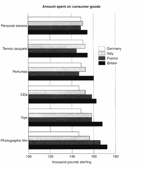
(Cambridge 3 – TEST 2)
MODEL ANSWER:
The bar chart compares consumer spending on six different items in Germany, Italy, France and Britain.
It is clear that British people spent significantly more money than people in the other three countries on all six goods. Of the six items, consumers spent the most money on photographic film.
People in Britain spent just over £170,000 on photographic film, which is the highest figure shown on the chart. By contrast, Germans were the lowest overall spenders, with roughly the same figures (just under £150,000) for each of the six products.
The figures for spending on toys were the same in both France and Italy, at nearly £160,000. However, while French people spent more than Italians on photographic film and CDs, Italians paid out more for personal stereos, tennis racquets and perfumes. The amount spent by French people on tennis racquets, around £145,000, is the lowest figure shown on the chart.
REFERENCE ANSWER:
The chart shows that Britain, among the four European countries listed, has spent most heavily on the range of consumer goods included. In every case, British spending is considerably higher than that of other countries; only in the case of tennis racquets does another country, Italy, come close.
In contrast, Germany is generally the lowest spender. This Is most evident in photographic film, where Germany spends much less than Britain. Germany only spends more than another country, France, in two cases; tennis racquets and perfumes.
Meanwhile, France and Italy generally maintain middle positions, averaging approximately similar spending overall. Specifically, France spends more on CDs and photographic film but less on tennis racquets than Italy does. Italy’s spending on personal stereos is only marginally greater than that of France, while spending on toys is equal between the two.
It is clear from the data given that there are some significant differences in spending habits within Europe.
The charts below show the levels of participation in education and science in developing and industrialised countries in 1980 and 1990. Write a report for a university lecturer describing the information shown below.
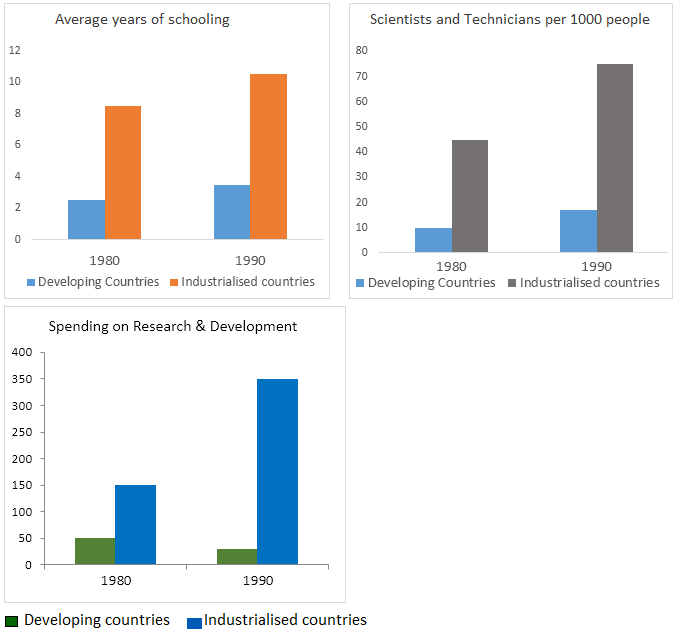
(Cambridge 3 – TEST 3)
MODEL ANSWER:
The three bar charts show average years of schooling, numbers of scientists and technicians, and research and development spending in developing and developed countries. Figures are given for 1980 and 1990.
It is clear from the charts that the figures for developed countries are much higher than those for developing nations. Also, the charts show an overall increase in participation in education and science from 1980 to 1990.
People in developing nations attended school for an average of around 3 years, with only a slight increase in years of schooling from 1980 to 1990. On the other hand, the figure for industrialised countries rose from nearly 9 years of schooling in 1980 to nearly 11 years in 1990.
From 1980 to 1990, the number of scientists and technicians in industrialised countries almost doubled to about 70 per 1000 people. Spending on research and development also saw rapid growth in these countries, reaching $350 billion in 1990. By contrast, the number of science workers in developing countries remained below 20 per 1000 people, and research spending fell from about $50 billion to only $25 billion.
REFERENCE ANSWER:
The data shows the differences between developing and industrialised countries’ participation in education and science.
In terms of the number of years of schooling received, we see that the length of time people spend at school in industrialised countries was much greater at 8.5 years in 1980, compared to 2.5 years in developing countries. The gap was increased further in 1990 when the figures rose to 10.5 years and 3.5 years respectively.
We can see a similar pattern in the second graph, which shows that the number of people working as scientists and technicians in industrialised countries increased from 55 to 85 per 1,000 people between 1980 and 1990, while the number in developing countries went from 12 to 20.
Finally, the figures for spending on research and development show that industrialised countries more than doubled their spending, from $200bn to $420bn, whereas developing countries actually decreased theirs, from $75bn down to $25bn.
Overall, we can see that not only are there very large differences between the two economies but that these gaps are widening.
The chart below shows the main reasons for study among students of different age groups and the amount of support they received from employers.
Summarise the information by selecting and reporting the main features, and make comparisons where relevant.


Age
(Cambridge 5 – TEST 2)
The charts below give information about USA marriage and divorce rates between 1970 and 2000, and the marital status of adult Americans in two of the years.
Summarise the information by selecting and reporting the main features, and make comparisons where relevant.

(Cambridge 6 – TEST 4)
MODEL ANSWER:
The first bar chart shows changes in the number of marriages and divorces in the USA, and the second chart shows figures for the marital status of American adults in 1970 and 2000.
It is clear that there was a fall in the number of marriages in the USA between 1970 and 2000. The majority of adult Americans were married in both years, but the proportion of single adults was higher in 2000.
In 1970, there were 2.5 million marriages in the USA and 1 million divorces. The marriage rate remained stable in 1980, but fell to 2 million by the year 2000. In contrast, the divorce rate peaked in 1980, at nearly 1.5 million divorces, before falling back to 1 million at the end of the period.
Around 70% of American adults were married in 1970, but this figure dropped to just under 60% by 2000. At the same time, the proportion of unmarried people and divorcees rose by about 10% in total. The proportion of widowed Americans was slightly lower in 2000.
A CANDIDATE’S ANSWER:
This is an answer written by a candidate who achieved a Band 6.5 score. Here is the examiner’s comment:
The Task Achievement is the weak point in this answer. Some of the data is summarized but the points are not well- selected to convey the key trends show in the charts. The main features of the first chart are not adequately presented and the overall conclusion does not summarise the main information. No figures are given to illustrate the points made.
The information is well organized, however, with clear paragraphing and well signaled sections. The accurate use of range of sequencers and other linkers make it easy to follow the writing. There are examples of errors but they are not frequent and do not cause confusion.
A range of vocabulary is used with flexibility, in spite of some in appropriate collocations and awkward phrasing. Structures are varied and generally accurate, while any mistakes do not make the message unclear.
We are given two charts which show us a few sets of date about the marital status of the Americans between 1970 and 2000.
The first chart compares the number of marriages and divorces in the United States of America between 1970 and 2000. We can see that data is given for each decade, the number of people who are getting married decreased slightly since 1980 as well as the divorces one. Nevertheless, divorces increased between 1970 and 1980.
The second chart is more precise about the different marital status of the Americans between 1970 and 2000. The number of divorced people has risen more than the double during this two years, and the data for the never married people has also increased significantly. However, less and less people are married, as the first chart showed us; the widowed American number is also decreasing.
As a conclusion, we can say that the marital status background of the Americans has maybe known the greatest change it had ever seen.
The chart below shows information about changes in average house prices in five different cities between 1990 and 2002 compared with the average house prices in 1989.
Summarise the information by selecting and reporting the main features, and make comparisons where relevant.
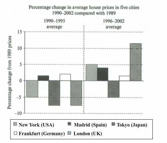
(Cambridge 7 – TEST 3)
MODEL ANSWER:
The bar chart compares the cost of an average house in five major cities over a period of 13 years from 1989.
We can see that house prices fell overall between 1990 and 1995, but most of the cities saw rising prices between 1996 and 2002. London experienced by far the greatest changes in house prices over the 13-year period.
Over the 5 years after 1989, the cost of average homes in Tokyo and London dropped by around 7%, while New York house prices went down by 5%. By contrast, prices rose by approximately 2% in both Madrid and Frankfurt.
Between 1996 and 2002, London house prices jumped to around 12% above the 1989 average. Homebuyers in New York also had to pay significantly more, with prices rising to 5% above the 1989 average, but homes in Tokyo remained cheaper than they were in 1989. The cost of an average home in Madrid rose by a further 2%, while prices in Frankfurt remained stable.
A CANDIDATE’S ANSWER:
This is an answer written by a candidate who achieved a Band 6.5 score. Here is the examiner’s comment:
The answer clearly presents and illustrates the key points of the information. The writer groups the data effectively and draws clear comparisons, although these could be more appropriately extended in the overview. Information is well organized across the response and a range of liking devices is used.
The opening paragraph, however, is an inadequate paraphrase of language given in the task, and although there are some appropriate collocations in the response, overall the range of vocabulary is rather restricted. Control is good, however, with few examples of error
A variety of structures is used with some fluency. There are occasional errors in punctuation and there are also some omission and errors in grammar but these tend to be minor and do not reduce communication.
The chart gives information about the percentage change in average house prices in five different cities located in five different countries over 12 year period between 1990 and 2002 compared with the average house prices in 1989.
According to the chart, during the period from 1990 to 1195 the average prices of house in three cities decreased significantly by five percent in New York (USA) and about 7.5 percent in both Tokyo (Japan) and London (UK) while the average house prices increased slightly in two cities Madrid (Spain) and Franfurt (Germany) by about 1.5 percent and 2 percent respectively.
As far as the next period (1996-2002) is concerned, it is clear that the average house prices decreased only in Tokyo (Japan) by 5 percent. In contrast the average house prices increased in the rest of cities. In New York it increased consideraply by 5% percent, in Madrid it increased slightly by 4 percent in Frankfurt it increased by 2 percent.
London has the largest increase in the average house price over the 6 year period from 1996 to 2002 as it increase dramatically by 11 percent.
All in all, there are wide differences in house prices between the five cities which illustrated in this chart. These differences may be a result of the number of population or the number of house required in a certain city.
The chart below shows the total number of minutes (in billions) of telephone call in the UK, divided into three categories, from 1995-2002.
Summarise the information by selecting a reporting the main features, and make comparisons where relevant.
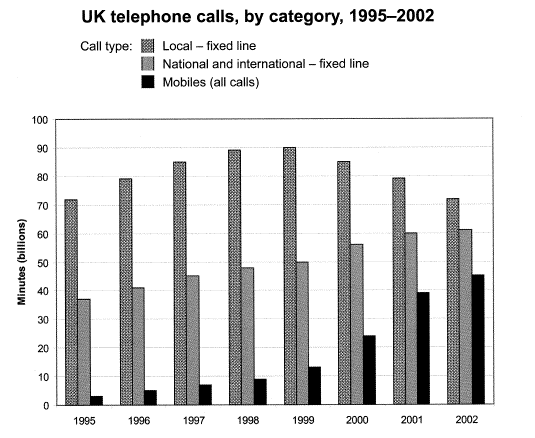
(Cambridge 9 – TEST 2)
MODEL ANSWER:
The bar chart compares the amount of time spent by people in the UK on three different types of phone call between 1995 and 2002.
It is clear that calls made via local, fixed lines were the most popular type, in terms of overall usage, throughout the period shown. The lowest figures on the chart are for mobile calls, but this category also saw the most dramatic increase in user minutes.
In 1995, people in the UK used fixed lines for a total of just over 70 billion minutes for local calls, and about half of that amount of time for national or international calls. By contrast, mobile phones were only used for around 4 billion minutes. Over the following four years, the figures for all three types of phone call increased steadily.
By 1999, the amount of time spent on local calls using landlines had reached a peak at 90 billion minutes. Subsequently, the figure for this category fell, but the rise in the other two types of phone call continued. In 2002, the number of minutes of national / international landline calls passed 60 billion, while the figure for mobiles rose to around 45 billion minutes.
REFERENCE ANSWER:
This model has been prepared by an examiner as an example of a very good answer. However, please note that this is just one example out of many possible approaches.
The chart shows the time spent by UK residents on different types of telephone calls between 1995 and 2002.
Local fixed line calls were the highest throughout the period, rising from 72 billion minutes in 1995 to just under 90 billion in 1998. After peaking at 90 billion the following year, these calls had fallen back to the 1995 figure by 2002.
National and international fixed line calls grew steadily from 38 billion to 61 billion at the end the period in question, though the growth slowed over the last two years.
There was a dramatic increase in mobile calls from 2 billion to 46 billion minutes. This rise was particularly noticeable between 1999 and 2002, during which time the use of mobile phones tripled.
To sum up, although local fixed line calls were still the most popular in 2002, the gap between the three categories had narrowed considerably over the second half of the period in question.
The charts below show what UK graduate and postgraduate students who did not go into full-time work did after leaving college in 2008.
Summarise the information by selecting a reporting the main features, and make comparisons where relevant.

(Cambridge 10 – TEST 3)
A CANDIDATE’S ANSWER:
This is an answer written by a candidate who achieved a Band 6.5 score. Here is the examiner’s comment:
This response reports the data on the bar charts accurately and gives an extended overview at the end. Information is logically organised and there is a clear progression throughout. The message can be followed with ease as a range of cohesive devices are used flexibly. Referencing and substitution are also well managed, however there are lapses in paragraphing. A range of vocabulary is used with no spelling errors, though word choice is not always appropriate (to seek further study, roughly almost, the percentage on the amount of, overuse of sought). These errors do not detract from overall clarity but they do reduce the communicative effect. A range of complex structures is also used accurately. Errorfree sentences are frequent and only a few mistakes occur (The graphs represents, we will notice), so grammar and punctuation are generally well controlled.
The graphs represents what UK graduates and postgraduates did after leaving college in 2008.
On the first graph, it shows that 17,735 graduate students sought part-time employment in 2008 while 3,500 did voluntary work and 29,665 decided unemployed after college, which is roughly almost the same amount as those who sought part-time work.
On the second graph, we see that 2,535 UK postgraduates did part-time work while only 345 did voluntary work. 2,725 UK postgraduates decided to study further which is slightly more than those who decided to take part-time employment. Lastly, 1,625 UK postgraduate students were not in the work force. The overall trend shows that most of the students, graduates and postgraduates alike, sought out further education while only a small number of students in both groups did voluntary work after leaving college. We will also notice that about a third in each group were unemployed. Lastly, the only difference that we will notice between the two groups is the percentage on the amount of students who went on to do part-time work with only one-third of the total amount in the graduate students and almost one-half with the postgraduate students.
The bar chart below shows the percentage of Australian men and women in different age groups who did regular physical activity in 2010.
Summarise the information by selecting a reporting the main features, and make comparisons where relevant.
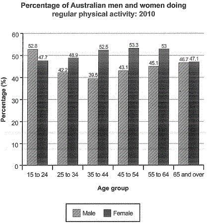
(Cambridge 12 – TEST 5)
MODEL ANSWER:
The chart compares the proportions of Australian males and females in six age categories who were physically active on a regular basis in the year 2010.
Roughly speaking, close to half of Australian adults did some kind of routine physical activity in 2010. Middle aged females were the most physically active, proportionally, while males aged 35 to 44 did the least physical activity.
In the youngest age category (15 to 24), almost 53% of Australian men but only 47.7% of women did regular physical activity in 2010. However, between the ages of 25 and 44, men were much less active on average than women. In fact, in the 35 to 44 age group, a mere 39.5% of males did some form of regular exercise, compared to 52.5% of females.
Between the ages of 45 and 64, the figure for male physical activity rose to around 45%, while the proportion of active females remained around 8% higher, at 53%. Finally, the percentages of Australian women and men aged 65 and over who exercised regularly were almost identical, at approximately 47%.
A CANDIDATE’S ANSWER:
This is an answer written by a candidate who achieved a Band 5.0 score. Here is the examiner’s comment:
The candidate covers the key features and rounds off the description with an overview. Organisation is evident, however not wholly logical, and it is sometimes difficult to relate data to specific age groups. Vocabulary is just about adequate, but is rather dependent on input material [regular physical activity / percentage]: original material is limited to e.g. [teenager / mid-twenties] with a lot of inaccuracy in word formation. Most sentence forms consist of simple structures and these are often inaccurate [bars’s changed and interesting / men’s percentage are increasing / the percentage more decrease until], though there is some accuracy in comparative forms [is higher than].
The bar chart below shows the percentage of Australia men and women in different age group who did regular physical activity in 2010. It’s interesting to the bar chart.
In 15 to 24, Australian men’s percentage of doing regular physical activity is 52.8 and women’s percentage is 47.7. Compare with men and women, men’s percentage is higher than women’s percentage. However, bars’s changed and interesting. After 25 to 64, men’s percentage are increasing. In 25 to 34, men’s percentage is 42,2. Besides, in 35 to 44, the percentage more decrease until 39.5. After over 45 age, a few increase like 43.7, 45.1 and 46.7.
However, the percentage couldn’t over 50%.
Then, women’s percentages are increase until 54 age like 52.5, 53.3. Although women’s percentages are decrease after 55 age, the percentages are higher than men’s percentages.
In conclusion, men did regular physical activity more than women when they were teenager and mid-twenties.
After mid-twenties, however, men’s percentage was decreased and women’s percentage was increase.
The chart below shows how frequently people in the USA ate in fast food restaurants between 2003 and 2013.
Summarise the information by selecting a reporting the main features, and make comparisons where relevant.

(Cambridge 12 – TEST 7)
MODEL ANSWER:
The bar chart illustrates the frequency with which Americans ate in fast food establishments from 2003 to 2013.
It is clear that the majority of Americans ate in fast food restaurants between once a week and once a month in all three years. We can also see a shift towards eating in these restaurants less frequently by the end of the 10-year period.
In each of the years shown on the chart, close to 60% of people in the US ate in fast food restaurants between once and four times a month. Roughly 15 to 20% of Americans reported eating in fast food outlets several times per week, while 3 to 4% of people ate in these outlets daily. At the other end of the scale, around 4% of people avoided fast food restaurants completely.
Between 2006 and 2013, the total proportion of Americans who ate in fast food establishments either once a week or several times a week fell by almost 10%. At the same time, there was an increase of around 8% in the ‘once or twice a month’ category. In other words, the weekly fast food habit that was common in 2003 and 2006 became a monthly or twice monthly habit in 2013.
A CANDIDATE’S ANSWER:
This is an answer written by a candidate who achieved a Band 6.5 score. Here is the examiner’s comment:
The candidate organises the information well and describes the trends in the various groups, but the lack of data to support the descriptions is a significant omission. There is a clear progression throughout the response, with good management of cohesive devices [percentage of people who / during the same period / in these segments of the chart / the groups in which / such facilities]. Lexis shows some flexibility and precision [on a weekly basis] and there is evidence of less common items [segments / major changes / most of the population / most, least popular / with the exception of] , with few errors in word choice [visualises / be / clients]. There is a variety of complex structures used with flexibility and accuracy, but there are also a few errors in grammatical control and in punctuation.
The chart visualises how often the US citizens be at fast-food restaurants in the years 2003, 2006 and 2013.
From 2003 to 2006 the percentage of people who have never eaten at a fast food restaurant has fallen by 1% but on the other hand during the same period the number of clients who eat fast food everyday has also fallen to about 3% of the population. Since 2006, no other changes have occurred in these segments of the chart.
The major changes can be seen in the groups, who eat in a fast-food restaurant on a weekly basis (once or several times a week) and in the groups in which people visit the fast-food restaurants once or twice a month or once a few months. While in 2006 most of the US citizens ate at such facilities at least once a week, in 2013 most of the population did so only once or twice a month. It’s clear that the fast-food restaurants were most popular in 2006 and least popular in 2013. However the number of people who eat in such restaurants only a few times every year didn’t change.
As a whole, with the exception of people who rarely or never eat fast food and in addition, the small part of the population who eat every day, the peak of going to fast-food restaurants was reached in 2006 in contrast with 2013 when most of the population spent time in them only once or twice a month.
The chart below shows the percentage of households in owned and rented accommodation in England and Wales between 1918 and 2011.
Summarise the information by selecting a reporting the main features, and make comparisons where relevant.

(Cambridge 13 – TEST 2)
A CANDIDATE’S ANSWER:
This is an answer written by a candidate who achieved a Band 6.0 score. Here is the examiner’s comment:
The candidate has identified all the main features and trends, including the fact that in 1971 the number of households in owned and rented households was the same. Comments are supported by dates and percentages of households and there is a short overview at the end of the script. Organisation is clear as the writer deals with each category in turn. The range of vocabulary is adequate but there are frequent spelling errors [comprssion I comparison I dramaticly droped I dramatically dropped I stated I stayed I yeas / year I leveled I levelled I Genarally / Generally I prectarge / percentage). These do not noticeably impede communication, however. There is a mix of grammatical structures and some complex sentence forms, though these are not always accurate: the meaning is still clear, however.
The provided bar chart depicts the compression of buying or renting houses in England and Wales from 1918 to 2011.
1918 the rented households was raised about 78 percentage. Then it leveled of between 1939 to 1953. From 1961 to 1981 it dramatically dropped to 35 percentage. This accommodation stated the same until 2001. In 2011 there was a slight increase in rented households and it was up to 38%.
The same yeas the owned ones has raise from 21% to 32% in 1918 to 1953. In 1939 to 1953 the was a graduate state in the percentage. Then it starts to level up to 69% in 1991. At 2001 to 2011 there was a decline in the owned accommodation and it was 62%.
Generally, both of the rented and owned households has raised and droped through the years from 1918 to 2011. The was a year that the were the same prectarge and it was 1971 which 50%
The bar chart below shows the top ten countries for the production and consumption of electricity in 2014.
Summarise the information by selecting a reporting the main features, and make comparisons where relevant.

(Cambridge 13 – TEST 3)
A CANDIDATE’S ANSWER:
This is an answer written by a candidate who achieved a Band 5.0 score. Here is the examiner’s comment:
This response is rather mechanical as it lists the countries in order of production and consumption of electricity, identifies the countries that produce and consume most and least and notes the fact that all the countries except Germany produce more than they consume. However, the writing is supported by data, although there are some errors in the figures (the figures for production in Russia, India and Brazil are inaccurate as is the figure for consumption in Japan). Organisation is limited and there are few examples of cohesive devices; similarly the range of vocabulary is limited although just adequate for the task. There is a mix of simple and complex sentence structures, but complex forms are mainly inaccurate [that have / has I Almost all the country have I Almost all the countries have].
From the bar chart that show the top ten countries for the production and consumption of electricity in 2014. For the production of electricity, the 1st rank is China that have 5,398 billion kwh, the 2nd rank is United States that have 4,099 billion kwh, the 3rd rank is Russia that have 1,059 billion kwh, the 4th rank is Japan that have 936.2 billion kwh, the 5th rank is India that have 891 billion kwh, the 6th rank is Canada that have 618.9 billion kwh, the 7th rank is France that have 561.2 billion kwh, the 8th rank is Brazil that have 530.9 billion kwh, the 9th rank is Germany that have 526.6 billion kwh and the 10th rank is Republic of Korea that have 485.1 billion kwh. For the comsumption of electricity, the 1st rank is China that have 5,322 billion kwh, the 2nd rank is United States that have 3,866 billion, the 3rd is Russia that have 1,038 billion kwh, the 4th rank is Japan that have 856.9 billion kwh, the 5th rank is India that have 698.8 billion kwh, the 6th rank is Germany that have 582.5 billion kwh, the 7th rank is Canada that have 499.9 kwh, the 8th rank is France that have 462.9 billion kwh, the 9th rank is Brazil that have 455.8 kwh and the 10th is Republic of Korea that have 449.5 billion kwh.
From the information. The country that have the most in production and consumption is China. The country that have the least in production and consumption is Republic of Korea.
Almost all the country have production more than consumption, exept Germany that have consumption more than production.
The chart below shows the value of one country’s exports in various categories during 2015 and 2016. The table shows the percentage change in each category of exports in 2016 compared with 2015.
Summarise the information by selecting a reporting the main features, and make comparisons where relevant

(Cambridge 14 – TEST 2)
MODEL ANSWER:
The bar chart and table give information about a country’s export earnings from five groups of products in 2015 and 2016.
It is noticeable that export revenues in all but one of the five product categories increased over the period shown. While petroleum products were the highest earning exports in both years, the textile industry saw the most significant growth in earnings.
Export earnings from petroleum products rose from around $61 billion in 2015 to $63 billion in 2016, which was an increase of 3%. Income from engineered goods reached a similar level. The country’s export earnings from these goods went up by 8.5% to approximately $62 billion in 2016.
From 2015 to 2016, there was a 15.24% increase in export revenue from textiles, with earnings rising from roughly $25 billion to over $30 billion. By contrast, there was almost no change in the amount of money earned from agricultural products, which remained at just over $30 billion. Finally, the only decline in income occurred in the gems and jewellery product group, where export earnings fell by around 5% to approximately $40 billion in 2016.
A CANDIDATE’S ANSWER:
This is an answer written by a candidate who achieved a Band 6.0 score. Here is the examiner’s comment:
The response covers all the key features and presents an overview in the final paragraph. However, the rating could be improved by providing data in $ billions for earnings for each product (not just engineered goods and textiles). One of the comments is debatable [This statistic also conclude that the engineers in the country have gained more by the year 2016]. Organisation follows the order of the bar chart, providing an overall progression, and there is some use of cohesive devices to signal a change of topic. The vocabulary used provides some variety of expression [differ I gained I decreased], even if it is not always appropriate [money making I profitable I textures I textiles). Errors occur [earning(s) I foot step I footstep I stills], but the intended meaning is clear. The candidate uses both simple and complex sentence forms, but better control of both grammar and punctuation might result in a higher rating here.
The value of a country’s exports may vary in various categories in different years. Usually, the percentage of changes or exports earning will differ by year and category. There is some information about a country’s exports earning based on the year 2015 and 2016.
First, I will start with the country’s most money-making export which is petroleum products. By the year 2016, the country gained 3% more in the category than the year 2015. However, for gems and jewellery, the percentage of the export earning decreased by 5.18% by the year 2016.
Next, engineered goods earnings also follow the foot steps of petroleum product earnings by gaining more than 8% on 2016 than 2015. The value increases from more than 50 billions to more than 60 billions in just a year. This statistic also conclude that the engineers in the country have gained more by the year 2016.
Besides that, agricultural products and textiles also earned more with 0.81% and 15.24% respectively. Even though, agricultural products does not gain more than 1%, it stills conclude that the products are still wanted by many people as it earned about more than 30 billions for both years.
While for textures, it is seen that it gains it popularity in the year 2016. This is proved, when the statistic states that the earning was increased by more than 15.24% in the year 2016 based on the year 2015. Textiles products earned about more than 25 billions in 2015 and earned more than 30 billions in the next year.
In conclusion, we can see that this country has overall succeed in the year 2016 than the year 2015. The country managed to gain about more than 22% in the year 2016. Even though gems and jewellery had a decreasing of earnings by 5.18%, it is still the third money-making export product from the country.
The chart below shows the results of a survey about people’s coffee and tea buying and drinking habits in five Australian cities.
Summarise the information by selecting a reporting the main features, and make comparisons where relevant.

(Cambridge 15 – TEST 1)
A CANDIDATE’S ANSWER:
This is an answer written by a candidate who achieved a Band 6.0 score. Here is the examiner’s comment:
This answer covers all three categories and shows a good level of grouping and comparison of information in each category. The descriptions are supported by accurate data. Organisation is clear (introduction and overview, one paragraph per category) and there is evidence of cohesive devices [The first option I The second line I The last option]. Vocabulary is generally adequate and appropriate for the task, in spite of occasional errors [questionare I questionnaire I amost I almost]. Grammar shows a mix of simple and complex sentence structures with a reasonable level of accuracy. A wider range of vocabulary and/or grammatical range would help to improve the score here.
The table depicts the outcomes of a questionare of how often people buy and drink a different types of coffee in Sydney, Melbourne, Brisbane, Adelaide, and Hobart of Australia.
The first option is bought fresh coffee in last 4 weeks. In Sydney has 43.7 per cent of city residents and has almost the same amount as Melbourne which is 42.2 per cent. Brisbane and Adelaide have a nearly same amount 34.2 per cent and 34.4 per cent. Next, Hobart has 383.3 per cent.
The second line is bought instant coffee in last 4 weeks. Brisbane has 52.6 per cent. Other two cities that have amost the same number are Adelaide, 49.8 per cent, and Melbourne, 48.3 per cent. The lowest number is 45.5 per cent of Sydney and The highest number is 54.1 per cent of Hobart.
The last option of the survey shows percentage of city residents that went to a café for coffee or tea in last 4 weeks. In Sydney, people went to a café for coffee or tea in last 4 weeks 61 per cent of city residents. In Brisbane, citizens went to a café for coffee or tea in last 4 weeks 55.4 per cent. The lowest is Adelaide that shows 49.9 per cent of city residents. In Hobart, people went to a café for coffee or tea in last 4 weeks 62.7 per cent. The highest is Melbourne that shows 63.3 per cent.
In conclusion, the highest number of the survey is the percentage of city residents that went to a café for coffee or tea in last 4 weeks because it shows almost the highest percentage in 3 types.
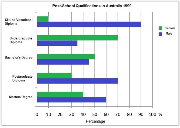
The chart below shows the different levels of post school qualification in Australia and the proportion of men and women who held them in 1999.
Summarise the information by selecting and reporting the main features, and make comparisons where relevant.
The chart below compares levels of recycling, as well as some less environmentally friendly forms of waste management, in fifteen European countries.
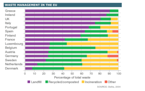
MODEL ANSWER:
The bar chart shows the percentage of waste that is recycled, put into landfill or incinerated in various EU countries.
If we look at the fifteen EU countries as a whole, it is clear that more waste goes to landfill sites than to any other refuse management facility. In fact, while around half of the countries put the majority of their waste into landfill sites, only two countries recycle at least 50% of the waste that they produce.
Austria and Belgium are the most environmentally friendly of the fifteen countries, recycling around 60% and 50% of their waste respectively. Germany, Sweden and Belgium also appear to have effective recycling programmes, resulting in roughly 40% of waste being processed in this way in each country.
Other EU countries recycle far less. Greece, Ireland and the UK, for example, only recycle around 10% of refuse, and put between 80 and 90 per cent of their waste into landfill. Finally, while most non-recycled waste in the EU area goes to landfill, four countries, namely Luxembourg, Sweden, the Netherlands and Denmark, incinerate more waste than they bury.
0