

3. PIE CHART QUESTIONS - IELTS PAST PAPERS & SAMPLE PAPERS WRITING TASK 1 PIE CHART
July 1,2025
root
The pie chart below shows units of electricity production by fuel source in Australia and France in 1980 and 2000.
Summarise the information by selecting and reporting the main features, and make comparisons where relevant.

(Cambridge 7 – TEST 4)
MODEL ANSWER:
The pie charts compare the amount of electricity produced using five different sources of fuel in two countries over two separate years.
Total electricity production increased dramatically from 1980 to 2000 in both Australia and France. While the totals for both countries were similar, there were big differences in the fuel sources used.
Coal was used to produce 50 of the total 100 units of electricity in Australia in 1980, rising to 130 out of 170 units in 2000. By contrast, nuclear power became the most important fuel source in France in 2000, producing almost 75% of the country’s electricity.
Australia depended on hydro power for just under 25% of its electricity in both years, but the amount of electricity produced using this type of power fell from 5 to only 2 units in France. Oil, on the other hand, remained a relatively important fuel source in France, but its use declined in Australia. Both countries relied on natural gas for electricity production significantly more in 1980 than in 2000.
REFERENCE ANSWER:
The charts compare the sources of electricity in Australia and France in the years 1980 and 2000. Between these years electricity production almost doubled, rising from 100 units to 170 in Australia, and from 90 to 180 units in France.
In 1980 Australia used coal as the main electricity source (50 units) and the remainder was produced from natural gas, hydro power (each producing 20 units) and oil (which produced only 10 units). By 2000, coal had become the fuel for more than 75% of electricity produced and only hydro continued to be another significant source supplying approximately 20%.
In contrast, France used coal as a source for only 25 units of electricity in 1980, which was matched by natural gas. The remaining 40 units were produced largely from oil and nuclear power, with hydro contributing only 5 units. But by 2000 nuclear power, which was not used at all in Australia, had developed into the main source, producing almost 75% of electricity, at 126 units, while coal and oil together produced only 50 units. Other sources were no longer significant.
Overall, it is clear that by 2000 these two countries relied on different principal fuel sources: Australia relied on coal and France on nuclear power.
The three pie charts below show the changes in annual spending by the particular UK school in 1981, 1991 and 2001.
Summarise the information by selecting and reporting the main features, and make comparisons where relevant.

(Cambridge 8 – TEST 2)
REFERENCE ANSWER:
The charts show how much a UK school spent on different running costs in three separate years: 1981, 1991 and 2001.
In all three years, the greatest expenditure was on staff salaries. But while other workers’ salaries saw a fall from 28% in 1981 to only 15% of spending in 2001, teachers’ pay remained the biggest cost, reaching 50% of total spending in 1991 and ending at 45% in 2001.
Expenditure on resources such as books had increased to 20% by 1991 before decreasing to only 9% by the end of the period. In contrast, the cost of furniture and equipment saw an opposite trend. This cost decreased to only 5% of total expenditure in 1991 but rose dramatically in 2001 when it represented 23% of the school budget. Similarly, the cost of insurance saw a rising trend, growing from only 2% to 8% by 2001.
Overall, teachers’ salaries constituted the largest cost to the school, and while spending increased dramatically for equipment and insurance, there were corresponding drops in expenditure on things such as books and on other workers’ salaries.
The charts below give information on the ages of the populations of Yemen and Italy in 2000 and projections for 2050.
Summarise the information by selecting and reporting the main features, and make comparisons where relevant.

(Cambridge 9 – TEST 3)
A CANDIDATE’S ANSWER:
This is an answer written by a candidate who achieve a band 6.0 score. Here is the examiner’s comment:
The answer addresses the task, reporting sufficient details for the reader to be accurately informed, even though in each chart one element is implied rather than overtly stated. Clear comparisons are drawn between two countries. An overview is given, although focusing on only one age group reduces its clarity. The information is well organized and a range of linking devices used, e.g. whereas; the latter country. Vocabulary is adequate for the task and generally accurate, though attempts to use less common words are less successful. A few errors occur in word formation, e.g. statistic (statistical); estimative (estimate), but they do not affect understanding. Simple and complex sentence forms are produced with few grammatical errors, but the range of structures is rather restricted.
The diagrams show statistic information regarding the ages of the habitants of Yemen and Italy in 2000 and also a estimative for 2050.
We can see that in 2000 the majority of people in Yemen was between 0 and 14 years old, whith 50.1% whereas in Italy most of the population was between 15-59 years old (61.6%), in the same year. On the other hand, just 3.6% of people in the former country was 60 years old or more in 2000, while in the latter country this figure is represented with 24.1%.
The projections for 2050 show that the number of people with 15-59 years and 60 years or more will increase in Yemen, reaching 57.3% and 5.7% respectively. In contrast, in Italy, the population with 15-59 years will decreased to 46.2%, while people with 60 years or more will grow to 42.3%.
Overall, it is possible to see that there is an upward trend on the rates of people with 60 years or more in both countries.
The first chart below shows how energy is used in an average Australian household. The second chart shows the greenhouse gas emissions which result from this energy use.
Summarise the information by selecting and reporting the main features, and make comparisons where relevant.

(Cambridge 10 – TEST 1)
A CANDIDATE’S ANSWER:
This is an answer written by a candidate who achieved a Band 4.5 score. Here is the examiner’s comment:
The response generally addresses the requirements of the task but there is no clear overview. Key features of the two pie charts are presented but not adequately covered, and there is a tendency to focus on details without referring to the bigger picture. Organisation is evident. The relationship of ideas can be followed (and, First, but, Secondly, The former, The latter) but the sentences are not fluently linked to each other. Vocabulary is limited but just adequate for the task. Simple vocabulary is used accurately but the range does not allow much variation in expression. There are noticeable errors in spelling, though these do not cause strain. A limited range of grammatical structures is used; subordinate clauses are rare and most sentences are simple. Even simple sentences often contain errors (The latter have), so grammatical errors are frequent and can cause severe strain for the reader. Control over sentence formation is weak.
This chart shows the energy consumption of an average Australian household and how propotion of emitting greenhouse gas in each type of active.
First, the bigger different informations are using heating and other appliances, relate to 42% and 15%, but they going up side down in gas emittions, which is 15% and 28%.
Secondly, using energy of lighting and refrigeration are similar change in greenhouse gas emittions. The former using 4$ energy and produce double number of emittions to 8%. The latter have the same situation about 7% in using energy but emit 14% greenhouse gas.
The last two parts of things are water heating which is second large source of using energy and the smallest consuming energy one = cooling. Indeed, there are just a marginally change in greenhouse gas emittions which grow from 30% to 32% and rise from 2% to 3%.
The charts below show the percentage of water used for different purposes in six areas of the world.
Summarise the information by selecting and reporting the main features, and make comparisons where relevant.
Percentage of water used for different purposes in six areas of the world

(Cambridge 11 – TEST 1)
A CANDIDATE’S ANSWER:
This is an answer written by a candidate who achieved a Band 4.5 score. Here is the examiner’s comment:
The candidate covers all the data in the charts, but there is some inaccuracy in his description (the largest percentage went with the Agricultural and farms) (not true in all cases) and there is a shortage of data to support the descriptions. There is an attempt to summarise the main points at the end of the description. Information is evident, but it is not arranged coherently (the description jumps from different usage in general to specific use in different countries, but this does not follow a logical sequence). Without reference back to the individual charts, it is hard to follow the description, especially where reference is also unclear (it, them, they). The range of lexis is just adequate for the task (largest percentage, greatest number, a lot, the second after Asia), but there is reliance on input material and errors in spelling are noticeable, even where the lexis is supplied in the prompt or the diagrams. A very limited range of structures is used and grammatical errors are frequent (… all of pie charts have the got . . . , . . . they almost the second after Asia use water in industrial and opposite of Europe, . . . they slightly same in industrial use, . . . South Asia and South America are uses the water in Agricultural rather than industrial). The script represents a mixed profile, but overall achieves Band 4.5.
The chart indicates to five places on the earth. Talking about water and the ways of using it.
It seen obvious all of pie charts have the got the lowest precentage in the domestic uses like at home. However, the largest precentage went with the Agricultural and farms. The center of Asia has the greatest numbers of precentage of Agricultural use. On the other hand in Europe they did not use water so much as central Asia or Africa. They just use 32.4%. But in the industrall they use it alot and the largest precentage with them. If we check on Africa, it seen they almost the second after Asia use water in industrial and opposite of Europe.
In North America and Europe they slightly same in industrial use and just less 4 precentages to Europe. South Asia and South America are uses the water in Agricultural rather than industrial.
Overall, they all use water much in the farm and Agricultural. Europe and North America they use water more than others in the industrial areas. Africa got the lowest percentage in domestic and industrial uses.
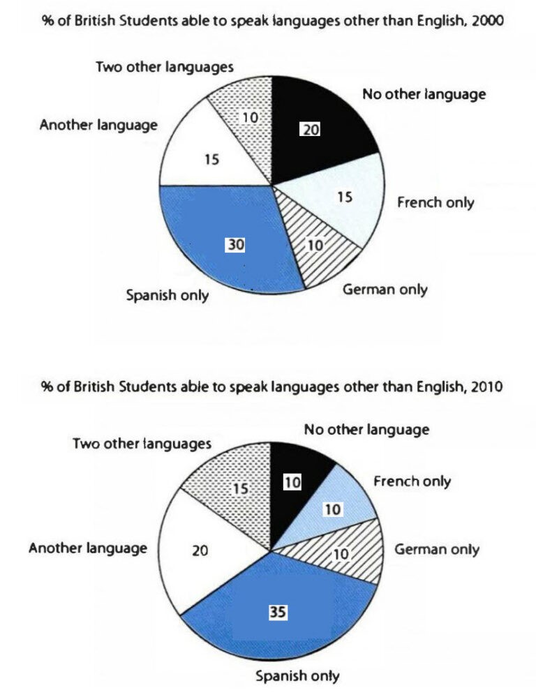
The charts below show the proportions of British students at one university in England who were able to speak other languages in addition to English, in 2000 and 2010.
Summarise the information by selecting and reporting the main features, and make comparisons where relevant.
(Cambridge 11 – TEST 2)
MODEL ANSWER:
The tables compare the percentages of British university students who spoke different languages in addition to English in two separate years.
It is noticeable that in both years, 2000 and 2010, the majority of British students at the university in question were able to speak at least one other language. We can also see an increase in the proportion of second and third language speakers over the 10-year period.
In the year 2000, 80% of the students were able to speak one or two foreign languages, and 20% only spoke English. Ten years later, there was a rise of 5% in the proportion of those who spoke a second language. There was also an increase, from 10% to 15%, in the proportion of students who were able to speak two foreign languages.
Looking at the specific second languages spoken, in 2000, 30% of the students were able to speak Spanish, 15% spoke French, and 10% spoke German. By 2010, the proportion of Spanish speakers had risen to 35%, there were 5% fewer French speakers, and the figure for German speakers remained at one in ten. Finally, we can see that the percentage of speakers of other second languages, apart from Spanish, French and German, rose from 15% to 20% over the period shown.
A CANDIDATE’S ANSWER:
This is an answer written by a candidate who achieved a Band 6 score. Here is the examiner’s comment:
The candidate covers all the key features of the task and rounds off the description with an overview. There is some repetition of information and some irrelevant commentary (which is good because it shows that more people have learned other languages well). Information is arranged coherently and there is a clear overall progression, with effective use of cohesive devices, though there is a tendency to rely on dates. The range of vocabulary is adequate for the task, but the writer does not attempt any less common items. There is a mix of simple and complex sentence forms, with a fair degree of accuracy, but the range would need to be wider to achieve a higher score.
The charts show the percentage of the British students, who are able to speak languages other than English in 2000 and in 2010. In 2000, 20% of the British students were not able to speak another language. But in 2010 the number has decreased to 10%, which is good because it shows that more people have learned other languages well.
The biggest percentage had Spanish only with 30% in 2000. However it has increased by 5% and is in 2010 still the highest percentage with 35%.
In 2000, German only and two other languages were the lowest ones, both with 10%. While in 2010 French only, German only and two other languages show the lowest percentage, while all of them got 10%. All in all, the percentage of German only in 2000 and 2010 hasn’t changed. The percentage of French only has decreased by 5%. No other languages percentage was reduced by the half from the 20% in 2000 to 10% in 2010.
The number of people, who are speaking two other languages has increased by half. In 2000 there were 10% and in 2010 there are 15%.
Another interesting fact is that the percentage of another language has improved as well from 15% to 20%.
But still, the most common learned language is Spanish only. In 2000 there were 30% of English students who spoke it fluently, while in 2010 the number has increased further to 35%.
The table below shows the numbers of visitors to Ashdown Museum during the year before and the year after it was refurbished. The charts show the result of surveys asking visitors who satisfied they were with their visit, during the same two periods.
Summarise the information by selecting and reporting the main features, and make comparisons where relevant.

(Cambridge 11 – TEST 4)
A CANDIDATE’S ANSWER:
This is an answer written by a candidate who achieved a Band 7 score. Here is the examiner’s comment:
The candidate covers the main features of the table and charts, and gives a satisfactory overview of the data. The information is logically organised with a clear progression in the way points are presented. Cohesive devices are used effectively (during the same two periods), but not always accurately (on a contrary). A range of vocabulary is used flexibly (shows a negative pattern, illustrates that, an upward trend, has reached its aim), but there are occasional errors in word choice (the amount of visitors, It is obviously). The candidate has used a variety of complex structures (the charts that show the result of surveys asking people how satisfied they were with their visit, after the refurbishment from 74,000 before the reconstruction to 92,000 after it had been done). There is good control of grammar, although there are a few minor errors (there is the charts). Punctuation is generally well controlled, but full stops are missing at the end of the first and final paragraphs and there are a few minor errors (lets look).
The table below shows the amount of visitors to Ashdown Museum during the years after and the year before it was modernized. After the table there is the charts that show the result of surveys asking people how satisfied they were with their visit those museum, during the same two periods.
It is obviously that the numbers of visitors significantly increased after the refurbishment from 74000 before the reconstructions to 92000 after it had been done. Now let’s look at the charts. The year before refurbishment shows a negative pattern: the results of survey illustrate that only 15% of visitors were very satisfied and the number of dissatisfied people was 40%. The year after refurbishment illustrates that the number of dissatisfied visitors declined and became 15%, on a contrary, people who were very satisfied increased to 35%. Comparing the amount of satisfied visitors we can also see an upward trend (it increased from 30% to 40% after the refurbishment).
To sum up, we can say that all work that has been done to attract new visitors to Ashdown Museum has reached its aim.
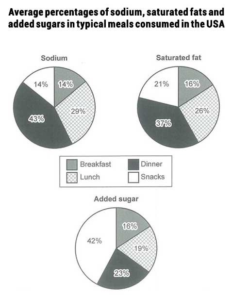
The charts below show the average percentages in typical meals of three types of nutrients, all of which may be unhealthy if eaten too much.
Summarise the information by selecting and reporting the main features, and make comparisons where relevant.
(Cambridge 14 – TEST 1)
A CANDIDATE’S ANSWER:
This is an answer written by a candidate who achieved a Band 6.5 score. Here is the examiner’s comment:
The candidate has accurately reported the data for each chart and has presented a summary of the information, but could achieve a higher score by making comparisons across the charts, e.g. breakfast contains the lowest amounts of sodium, saturated fats and added sugar. The information is logically organised and there is a clear progression throughout the script. The main points are clearly signalled [The first chart I The second chart I All in all] and there are examples of other cohesive devices [each of them] . The range of vocabulary is varied [data I contains I an equal proportion of I consumed I consumption I illustrates]. Minor errors do not cause misunderstanding [adding up 14% of sodium]. There is a mix of simple and complex sentence structures, using active, passive and modal verb forms and there is also subordination through the use of participles [Through eating lunch I By eating dinner I followed by]. More variety in grammatical structures would perhaps achieve a higher score.
The diagrams illustrate the average proportions of three types of nutrients in typical meals, which can be unhealthy if consumed too much. The three types include sodium, saturated fats and added sugar. The data is taken from the United States of America.
The first chart shows the average percentages of sodium. Dinner contains the most sodium (43%). Breakfast and snacks include an equal proportion of sodium consumed, with each of them adding up 14% of sodium. Through eating lunch, 29% sodium is consumed. The second chart shows the percentages of saturated fat in meals. By eating dinner, 37% saturated fat is consumed. Lunch contributes to a consumption of 26% saturated fat, followed by snacks with 21% and breakfast with 16%. The last chart illustrates the proportions of added sugar. Snacks contain the highest amount of added sugar (42%). Dinner includes 23%. A typical dinner includes 23% added sugar, while lunch contains 19% and breakfast includes 16%.
All in all, the diagrams show that every typical meal consumed in the USA contains a percentage of at least 14% of nutrients that can be unhealthy if eaten too much.
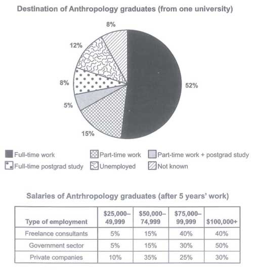
The charts below show what Anthropology graduates from one university did after finishing their undergraduate degree course. The table shows the salaries of the anthropologists in work after five years.
Summarise the information by selecting and reporting the main features, and make comparisons where relevant.
(Cambridge 15 – TEST 4)
A CANDIDATE’S ANSWER:
This is an answer written by a candidate who achieved a Band 6.0 score. Here is the examiner’s comment:
The candidate has described all the key features and has supported these with relevant figures. There is some comparison of the figures in both the chart and the table. Information is presented coherently and there is a clear overall progression (introduction, description of the pie chart information, description of the information in the table and conclusion). Some cohesive devices are used to organise the description [As we can see I Thus I Besides I So]. The range of vocabulary is adequate for the task [combined with I earn I proportion of I freelancers], but there are some errors [all the rest graduates I all the rest of the graduates I It is less I more than (the) proportion of freelance … same amount of money I concultantants / consultants I ninty I ninety I half bigger than I twice as big as]. There is a mix of simple and complex sentence structures, with some errors [(the) majority I a part time work I all the rest (of the) graduates I in (the) Government sector].
The chart demonstrates what Anthropology graduates from one university did after finishing their undergraduate degree course. The table indicates the salaries of the anthropologists in work after 5 years.
As we can see from the pie chart, majority of Anthropology graduates are employed. Fifty-two per cent of them have a full-time job. Almost twenty per cent of graduates have either a part-time work or it is combined with post grad study. Eight per cent of students continues their full-time education. Only twelve per cent of graduates are unemployed. The information about all the rest graduates is unknown.
Thus, most Anthropology graduates have a job. Half of those who work in Government sector earn more than a hundred thousand dollars. It is less than proportion of freelance concultantans who get the same amount of money. Besides, it is only one-third of those who work for private companies. We can see nearly the same percentage of those who get from fifty thousand dollars to ninty-nine thousand dollars as freelance consultants and in government sector. The situation is different in private companies. More of them get from fifty thousand to seventy-four thousand dollars than from seventy-five to ninety-nine thousand dollars. The proportion of those who work for private companies for from twenty-five thousand to forty-nine thousand dollars is half bigger than the same one in government sector and as freelancers.
So, the chart and the table show us that most of Anthropology graduates are employed and a salary more than twenty-give thousand dollars after five year’s work.
The charts below show the results of a questionnaire that asked visitors to the Parkway Hotel how they rated the hotel’s customer service. The same questionnaire was given to 100 guests in the years 2005 and 2010.

MODEL ANSWER:
The pie charts compare visitors’ responses to a survey about customer service at the Parkway Hotel in 2005 and in 2010.
It is clear that overall customer satisfaction increased considerably from 2005 to 2010. While most hotel guests rated customer service as satisfactory or poor in 2005, a clear majority described the hotel’s service as good or excellent in 2010.
Looking at the positive responses first, in 2005 only 5% of the hotel’s visitors rated its customer service as excellent, but this figure rose to 28% in 2010. Furthermore, while only 14% of guests described customer service in the hotel as good in 2005, almost three times as many people gave this rating five years later.
With regard to negative feedback, the proportion of guests who considered the hotel’s customer service to be poor fell from 21% in 2005 to only 12% in 2010. Similarly, the proportion of people who thought customer service was very poor dropped from 15% to only 4% over the 5-year period. Finally, a fall in the number of ‘satisfactory’ ratings in 2010 reflects the fact that more people gave positive responses to the survey in that year.
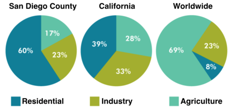
The pie charts below compare water usage in San Diego, California and the rest of the world.
MODEL ANSWER:
The pie charts give information about the water used for residential, industrial and agricultural purposes in San Diego County, California, and the world as a whole.
It is noticeable that more water is consumed by homes than by industry or agriculture in the two American regions. By contrast, agriculture accounts for the vast majority of water used worldwide.
In San Diego County and California State, residential water consumption accounts for 60% and 39% of total water usage. By contrast, a mere 8% of the water used globally goes to homes. The opposite trend can be seen when we look at water consumption for agriculture. This accounts for a massive 69% of global water use, but only 17% and 28% of water usage in San Diego and California respectively.
Such dramatic differences are not seen when we compare the figures for industrial water use. The same proportion of water (23%) is used by industry in San Diego and worldwide, while the figure for California is 10% higher, at 33%.
0