

4. TABLE QUESTIONS - IELTS PAST PAPERS & SAMPLE PAPERS WRITING TASK 1 TABLES
July 1,2025
root
QUESTION PAPER 1 QUESTION PAPER 2 QUESTION PAPER 3 QUESTION PAPER 4 QUESTION PAPER 5 QUESTION PAPER 1How to use this material:
Model answer – The type we follow at TEACH
Reference answer – We use for reference
Candidate’s answer – We use to understand the Writing Band descriptors, for students to analyze and practice how to improve a piece of writing.
You should spend about 20 minutes on this task.
Write at least 150 words.
The table below shows the proportion of different categories of families living in poverty in Australia in 1999.
Summarise the information by selecting and reporting the main features, and make comparisons where relevant.
Family type | Proportion of people from each household type living in poverty |
single aged person aged couple single, no children couple, no children sole parent couple with children all households | 6% (54,000) 4% (48,000) 19% (359,000) 7% (211,000) 21% (232,000) 12% (933,000) 11% (1,837,000) |
(Cambridge 4 – TEST 1)
REFERENCE ANSWER:
The table data presents information about the types of Australian families who were poverty-stricken in 1999. It also shows the number and proportion of such impoverished families for the same year.
Overall, more than 1.83 million Australian families were poor in 1999 and it comprised just over one-tenth of the total Australian households. Furthermore, poverty was more prevalent among soles parents and singles without any children.
As the data suggest, one out of five sole parents in Australia was destitute and it was the highest percentage of poverty among the given family types in 1999. The higher number of poor family, however, were the couples with children accounting for approximately one million households. 7% couples without children, on the other hand, were not affluent. 19% Single Australians without any child were needy while this rate among the elder citizens was fewer – 6% single ages person and 4% aged couple were poor and the total number of such families were 54,000 and 48,000 respectively.
QUESTION PAPER 2The table below gives information about the underground railway systems in six cities.
Summarise the information by selecting and reporting the main features, and make comparisons where relevant.
Underground Railway Systems
City | Date opened | Kilometres of route | Passengers per year ( in millions) |
London | 1863 | 394 | 775 |
Paris | 1900 | 199 | 1191 |
Tokyo | 1927 | 155 | 1927 |
Washington DC | 1976 | 126 | 144 |
Kyoto | 1981 | 11 | 45 |
Los Angeles | 2001 | 28 | 50 |
(Cambridge 5 – TEST 4)
A CANDIDATE’S ANSWER:
This is an answer written by a candidate who achieved a Band 7 score. Here is the examiner’s comment:
This answer selects and describes the information well. Key features are clearly identified, while unexpected differences are highlighted and illustrated. The answer is relevant and accurate with a clear overview.
Information is well organized using a good range of signals and link words. These are generally accurate and appropriate, although occasional errors occur
The writer successfully uses some less common words. There is a clear awareness of style but there are occasional inaccuracies and there is some repetition. Grammar is well-controlled and sentences are varied and generally accurate with only minor errors.
The table shows the details regarding the underground railway systems in six cities.
London has the oldest underground railway systems among the six cities. It was opened in the year 1863 and it is already 140 years old. Paris is the second oldest, in which it was opened in the year 1900. This was them followed by the opening of the railway system in Tokyo, Washington DC and Kyoto. Los Angeles has the newest underground railway system, and was only opened in the year 200%. In terms of the size of the railway systems, London, for certain, has the largest underground railway system. It has 394 kilometres of route in total which is nearly twice as large as the system in Paris. Kyoto in contrast, has the smallest system. It only has 11 kilometres of route, which is more than 30 times less than that of London
Interestingly, Tokyo which only has 155 kilometres of route, serves the greatest number of passengers per year, at 1927 millions passengers. The system in Paris has the second greatest number of passengers, at 1191 millions passengers per year. The smallest underground railway system, Kyoto, serves the smallest number of passengers per year as predicted
In conclusion, the underground railway systems in different cities vary a lot in the size of the system the number of passengers served per year and in the age of the system.
QUESTION PAPER 3The table below gives information about changes in modes of travel in England between 1985 and 2000.
Summarise the information by selecting and reporting the main features, and make comparisons where relevant.
Average distance in miles travelled per person per year, by mode of travel
| 1985 | 2000 |
Walking | 255 | 237 |
Bicycle | 51 | 41 |
Car | 3,199 | 4,806 |
Local bus | 429 | 274 |
Long distance bus | 54 | 124 |
Train | 289 | 366 |
Taxi | 13 | 42 |
Other | 450 | 585 |
All modes | 4,740 | 6,475 |
(Cambridge 6 – TEST 2)
MODEL ANSWER:
The chart shows average distances that people in England travelled using different forms of transport in the years 1985 and 2000.
It is clear that the total number of miles travelled by English people using all modes of transport increased significantly between 1985 and 2000. The car was by far the most used form of transport in both years.
In 1985, the average person travelled 3,199 miles by car, and this rose to 4,806 miles in the year 2000. The figures for miles travelled by train, long distance bus, taxi and other modes also increased from 1985 to 2000. Travel by taxi saw the most significant change, with more than a threefold increase from 13 miles per person per year in 1985 to 42 miles in 2000.
There was a fall in the average distances for three forms of transport, namely walking, bicycle and local bus. In 1985, English people walked an average of 255 miles, but this figure fell by 18 miles in 2000. Bicycle use fell from 51 to 41 miles over the period shown, while the biggest downward change was in the use of local buses, with average miles per person falling from 429 to 274 over the 15-year period.
A CANDIDATE’S ANSWER:
This is an answer written by a candidate who achieved a Band 6 score. Here is the examiner’s comment:
This answer does not introduce the information in the table, nor does it report it accurately. The figures are misinterpreted as representing the number of people rather than the average number of miles travelled per person per year. Consequently, the information about the increase in total travel is simply not mentioned, so not all key information is covered. There is an attempt to summarise trends in figures, but the reader cannot get a clear overall picture of the information because of the fundamental confusion. Nevertheless, the information is organized and the writing flows quite well because of good use of referencing and other connectors but there are occasional errors in these and the links between ideas are slightly confusing at times. The strong feature in this answer is the range of vocabulary which is used with some flexibility and good control. A good range of structures is also used, but there are still some fairly basic mistakes, such as in the choice of tense, subject/verb agreement and inappropriate use of the passive.
In 2000 the most preferred mode of travel is by car with 4,806 people. There’s a noticeable decrease in public transportation locally where it dropped from 429 people in 1985 to 274 people in 2000. However, the long distance bus rides is much more preferred by people as its figures are more than doubled in the last 15 years. People who chose to walk or cycle are decreased slightly in 2000 which probably made people to take the take the train more often. There’s a significant increase in the numbers of people who travelled by train. It jumped from 289 in 1985 to 366 in 200. This makes the train second popular mode of transportation. The biggest leap in the chart is the increase of taxi users who are tripled in 2000 with 42 people where it was only 13 in 1985.
Apart from all this modes of travel, there are some more different types of travel as well of course. Number of people choosing different modes of travel is rapidly increased from 450 to 585 in 2000.
QUESTION PAPER 4The table below gives information on consumer spending on different items in five different countries in 2002.
Summarise the information by selecting and reporting the main features, and make comparisons where relevant.
Percentage of national consumer expenditure by category-2002
Country | Food/Drinks/Tobacco | Clothing/Footwear | Leisure/Education |
Ireland | 28.91% | 6.43% | 2.21% |
Italy | 16.36% | 9.00% | 3.2% |
Spain | 18.80% | 6.51% | 1.98% |
Sweden | 15.77% | 5.40% | 3.22% |
Turkey | 32.14% | 6.63% | 4.35% |
(Cambridge 7 – TEST 1)
MODEL ANSWER:
The table shows percentages of consumer expenditure for three categories of products and services in five countries in 2002.
It is clear that the largest proportion of consumer spending in each country went on food, drinks and tobacco. On the other hand, the leisure/education category has the lowest percentages in the table.
Out of the five countries, consumer spending on food, drinks and tobacco was noticeably higher in Turkey, at 32.14%, and Ireland, at nearly 29%. The proportion of spending on leisure and education was also highest in Turkey, at 4.35%, while expenditure on clothing and footwear was significantly higher in Italy, at 9%, than in any of the other countries.
It can be seen that Sweden had the lowest percentages of national consumer expenditure for food/drinks/tobacco and for clothing/footwear, at nearly 16% and just over 5% respectively. Spain had slightly higher figures for these categories, but the lowest figure for leisure/education, at only 1.98%.
A CANDIDATE’S ANSWER:
This is an answer written by a candidate who achieved a Band 5.5 score. Here is the examiner’s comment:
This answer focuses on the key features of the information, clearly grouping the countries, using supporting figures and presenting on overview. However, there is no clear reference to what the percentages represent and key comparisons need more expansion
Information is organized with clear signaling and some effective referencing and linking, although not all ideas are clearly linked and the overall progression is achieved by repetition in the final section
The range of vocabulary is rather narrow and just sufficient for the task. The attempt to paraphrase the rubric shows limited flexibility. There are several spelling and word form errors, and quite a lot of repetition. Similarly, the range of sentence forms is not wide, with few examples of complex structures. However, apart from one or two errors in basic grammar, simple structures are accurate and easily understood.
Different countries’ consumer spendings are quite different. The table shows the vary consumer spending on a seires of items in the five countries, namely, the Ireland, Italy, Spain, Sweden and Turkey in 2002
Food, drinks and tobacco were in the most important position on consumer spending in all of the five countries, and in a different percentage. In Ireland and Turkey. They were near 30%, while in the other three countries they are under 20%
Clothing and footwear were the second important consumer spending in these countries. In Italy, they got 9% and in Sweden, they were 5,4%. In the other three countries, the figure were very similar, all were near 6,5%
The last consumer spending were leisure and education. In Turkey, they were 4,35% and in the other four countries the figure were under 4%
In conclusion, it can be said that in 2002, food, drinks and tobacco were the most important consumer spending in the five countries and the different countries’ consumer spending were quite different.
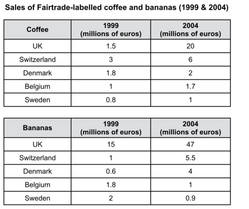
QUESTION PAPER 5The tables below give information about sales of Fairtrade-labelled coffee and bananas in 1999 and 2004 in five European countries.
Summarise the information by selecting and reporting the main features, and make comparisons where relevant.

(Cambridge 10 – TEST 2)
MODEL ANSWER:
The tables show the amount of money spent on Fairtrade coffee and bananas in two separate years in the UK, Switzerland, Denmark, Belgium and Sweden.
It is clear that sales of Fairtrade coffee rose in all five European countries from 1999 to 2004, but sales of Fairtrade bananas only went up in three out of the five countries. Overall, the UK saw by far the highest levels of spending on the two products.
In 1999, Switzerland had the highest sales of Fairtrade coffee, at €3 million, while revenue from Fairtrade bananas was highest in the UK, at €15 million. By 2004, however, sales of Fairtrade coffee in the UK had risen to €20 million, and this was over three times higher than Switzerland’s sales figure for Fairtrade coffee in that year. The year 2004 also saw dramatic increases in the money spent on Fairtrade bananas in the UK and Switzerland, with revenues rising by €32 million and €4.5 million respectively.
Sales of the two Fairtrade products were far lower in Denmark, Belgium and Sweden. Small increases in sales of Fairtrade coffee can be seen, but revenue remained at €2 million or below in all three countries in both years. Finally, it is noticeable that the money spent on Fairtrade bananas actually fell in Belgium and Sweden.
REFERENCE ANSWER:
This model has been prepared by an examiner as an example of a very good answer. However, please note that this is just one example out of many possible approaches.
The two tables contain sales data for Fairtrade coffee and bananas in 1999 and 2004, in five nations of Europe.
The first table shows low-level coffee sales increasing in all five countries, albeit to widely varying degrees. In two places sales increased by the same small amount: 1.8- 2 million euros in Denmark, and 0.8-1 million in Sweden. The increment was slightly larger in Belgium, from 1- 1.7 million euros. Meanwhile, in Switzerland sales doubled from 3-6 million euros. Finally, in the UK there was an enormous increase, from 1.5-20 million euros.
In the second table, it is Switzerland which stands out as buying far more Fairtrade bananas than the other four countries. Swiss sales figures jumped from 15-47 million euros across these five years, while in the UK and Belgium sales only grew from 1- 5.5 and from 0.6-4 million euros respectively. Sweden and Denmark showed a different pattern, with falls in banana sales from 1.8-1 and 2–0.9 million euros.
Comparing the two tables, it is clear that in 1999 Fairtrade coffee sales ranged from 0.8-3 million euros in these five countries, while banana sales also mostly clustered between 0.6 and 2 million euros, with Switzerland the outlier at a huge 15 million euros. By 2004, sales figures for both products had risen across the board, except for Sweden and Demark which recorded drops in banana sales.
Sources:
Cambridge IELTS
Nội dung mặc định bạn muốn chèn vào editorThe table below shows the proportion of different categories of families living in poverty in Australia in 1999.
Summarise the information by selecting and reporting the main features, and make comparisons where relevant.
|
Family type |
Proportion of people from each household type living in poverty |
|
single aged person aged couple single, no children couple, no children sole parent couple with children all households |
6% (54,000) 4% (48,000) 19% (359,000) 7% (211,000) 21% (232,000) 12% (933,000) 11% (1,837,000) |
(Cambridge 4 – TEST 1)
REFERENCE ANSWER:
The table data presents information about the types of Australian families who were poverty-stricken in 1999. It also shows the number and proportion of such impoverished families for the same year.
Overall, more than 1.83 million Australian families were poor in 1999 and it comprised just over one-tenth of the total Australian households. Furthermore, poverty was more prevalent among soles parents and singles without any children.
As the data suggest, one out of five sole parents in Australia was destitute and it was the highest percentage of poverty among the given family types in 1999. The higher number of poor family, however, were the couples with children accounting for approximately one million households. 7% couples without children, on the other hand, were not affluent. 19% Single Australians without any child were needy while this rate among the elder citizens was fewer – 6% single ages person and 4% aged couple were poor and the total number of such families were 54,000 and 48,000 respectively.
The table below gives information about the underground railway systems in six cities.
Summarise the information by selecting and reporting the main features, and make comparisons where relevant.
Underground Railway Systems
|
City |
Date opened |
Kilometres of route |
Passengers per year ( in millions) |
|
London |
1863 |
394 |
775 |
|
Paris |
1900 |
199 |
1191 |
|
Tokyo |
1927 |
155 |
1927 |
|
Washington DC |
1976 |
126 |
144 |
|
Kyoto |
1981 |
11 |
45 |
|
Los Angeles |
2001 |
28 |
50 |
(Cambridge 5 – TEST 4)
A CANDIDATE’S ANSWER:
This is an answer written by a candidate who achieved a Band 7 score. Here is the examiner’s comment:
This answer selects and describes the information well. Key features are clearly identified, while unexpected differences are highlighted and illustrated. The answer is relevant and accurate with a clear overview.
Information is well organized using a good range of signals and link words. These are generally accurate and appropriate, although occasional errors occur
The writer successfully uses some less common words. There is a clear awareness of style but there are occasional inaccuracies and there is some repetition. Grammar is well-controlled and sentences are varied and generally accurate with only minor errors.
The table shows the details regarding the underground railway systems in six cities.
London has the oldest underground railway systems among the six cities. It was opened in the year 1863 and it is already 140 years old. Paris is the second oldest, in which it was opened in the year 1900. This was them followed by the opening of the railway system in Tokyo, Washington DC and Kyoto. Los Angeles has the newest underground railway system, and was only opened in the year 200%. In terms of the size of the railway systems, London, for certain, has the largest underground railway system. It has 394 kilometres of route in total which is nearly twice as large as the system in Paris. Kyoto in contrast, has the smallest system. It only has 11 kilometres of route, which is more than 30 times less than that of London
Interestingly, Tokyo which only has 155 kilometres of route, serves the greatest number of passengers per year, at 1927 millions passengers. The system in Paris has the second greatest number of passengers, at 1191 millions passengers per year. The smallest underground railway system, Kyoto, serves the smallest number of passengers per year as predicted
In conclusion, the underground railway systems in different cities vary a lot in the size of the system the number of passengers served per year and in the age of the system.
The table below gives information about changes in modes of travel in England between 1985 and 2000.
Summarise the information by selecting and reporting the main features, and make comparisons where relevant.
Average distance in miles travelled per person per year, by mode of travel
|
|
1985 |
2000 |
|
Walking |
255 |
237 |
|
Bicycle |
51 |
41 |
|
Car |
3,199 |
4,806 |
|
Local bus |
429 |
274 |
|
Long distance bus |
54 |
124 |
|
Train |
289 |
366 |
|
Taxi |
13 |
42 |
|
Other |
450 |
585 |
|
All modes |
4,740 |
6,475 |
(Cambridge 6 – TEST 2)
MODEL ANSWER:
The chart shows average distances that people in England travelled using different forms of transport in the years 1985 and 2000.
It is clear that the total number of miles travelled by English people using all modes of transport increased significantly between 1985 and 2000. The car was by far the most used form of transport in both years.
In 1985, the average person travelled 3,199 miles by car, and this rose to 4,806 miles in the year 2000. The figures for miles travelled by train, long distance bus, taxi and other modes also increased from 1985 to 2000. Travel by taxi saw the most significant change, with more than a threefold increase from 13 miles per person per year in 1985 to 42 miles in 2000.
There was a fall in the average distances for three forms of transport, namely walking, bicycle and local bus. In 1985, English people walked an average of 255 miles, but this figure fell by 18 miles in 2000. Bicycle use fell from 51 to 41 miles over the period shown, while the biggest downward change was in the use of local buses, with average miles per person falling from 429 to 274 over the 15-year period.
A CANDIDATE’S ANSWER:
This is an answer written by a candidate who achieved a Band 6 score. Here is the examiner’s comment:
This answer does not introduce the information in the table, nor does it report it accurately. The figures are misinterpreted as representing the number of people rather than the average number of miles travelled per person per year. Consequently, the information about the increase in total travel is simply not mentioned, so not all key information is covered. There is an attempt to summarise trends in figures, but the reader cannot get a clear overall picture of the information because of the fundamental confusion. Nevertheless, the information is organized and the writing flows quite well because of good use of referencing and other connectors but there are occasional errors in these and the links between ideas are slightly confusing at times. The strong feature in this answer is the range of vocabulary which is used with some flexibility and good control. A good range of structures is also used, but there are still some fairly basic mistakes, such as in the choice of tense, subject/verb agreement and inappropriate use of the passive.
In 2000 the most preferred mode of travel is by car with 4,806 people. There’s a noticeable decrease in public transportation locally where it dropped from 429 people in 1985 to 274 people in 2000. However, the long distance bus rides is much more preferred by people as its figures are more than doubled in the last 15 years. People who chose to walk or cycle are decreased slightly in 2000 which probably made people to take the take the train more often. There’s a significant increase in the numbers of people who travelled by train. It jumped from 289 in 1985 to 366 in 200. This makes the train second popular mode of transportation. The biggest leap in the chart is the increase of taxi users who are tripled in 2000 with 42 people where it was only 13 in 1985.
Apart from all this modes of travel, there are some more different types of travel as well of course. Number of people choosing different modes of travel is rapidly increased from 450 to 585 in 2000.
The table below gives information on consumer spending on different items in five different countries in 2002.
Summarise the information by selecting and reporting the main features, and make comparisons where relevant.
Percentage of national consumer expenditure by category-2002
|
Country |
Food/Drinks/Tobacco |
Clothing/Footwear |
Leisure/Education |
|
Ireland |
28.91% |
6.43% |
2.21% |
|
Italy |
16.36% |
9.00% |
3.2% |
|
Spain |
18.80% |
6.51% |
1.98% |
|
Sweden |
15.77% |
5.40% |
3.22% |
|
Turkey |
32.14% |
6.63% |
4.35% |
(Cambridge 7 – TEST 1)
MODEL ANSWER:
The table shows percentages of consumer expenditure for three categories of products and services in five countries in 2002.
It is clear that the largest proportion of consumer spending in each country went on food, drinks and tobacco. On the other hand, the leisure/education category has the lowest percentages in the table.
Out of the five countries, consumer spending on food, drinks and tobacco was noticeably higher in Turkey, at 32.14%, and Ireland, at nearly 29%. The proportion of spending on leisure and education was also highest in Turkey, at 4.35%, while expenditure on clothing and footwear was significantly higher in Italy, at 9%, than in any of the other countries.
It can be seen that Sweden had the lowest percentages of national consumer expenditure for food/drinks/tobacco and for clothing/footwear, at nearly 16% and just over 5% respectively. Spain had slightly higher figures for these categories, but the lowest figure for leisure/education, at only 1.98%.
A CANDIDATE’S ANSWER:
This is an answer written by a candidate who achieved a Band 5.5 score. Here is the examiner’s comment:
This answer focuses on the key features of the information, clearly grouping the countries, using supporting figures and presenting on overview. However, there is no clear reference to what the percentages represent and key comparisons need more expansion
Information is organized with clear signaling and some effective referencing and linking, although not all ideas are clearly linked and the overall progression is achieved by repetition in the final section
The range of vocabulary is rather narrow and just sufficient for the task. The attempt to paraphrase the rubric shows limited flexibility. There are several spelling and word form errors, and quite a lot of repetition. Similarly, the range of sentence forms is not wide, with few examples of complex structures. However, apart from one or two errors in basic grammar, simple structures are accurate and easily understood.
Different countries’ consumer spendings are quite different. The table shows the vary consumer spending on a seires of items in the five countries, namely, the Ireland, Italy, Spain, Sweden and Turkey in 2002
Food, drinks and tobacco were in the most important position on consumer spending in all of the five countries, and in a different percentage. In Ireland and Turkey. They were near 30%, while in the other three countries they are under 20%
Clothing and footwear were the second important consumer spending in these countries. In Italy, they got 9% and in Sweden, they were 5,4%. In the other three countries, the figure were very similar, all were near 6,5%
The last consumer spending were leisure and education. In Turkey, they were 4,35% and in the other four countries the figure were under 4%
In conclusion, it can be said that in 2002, food, drinks and tobacco were the most important consumer spending in the five countries and the different countries’ consumer spending were quite different.
The tables below give information about sales of Fairtrade-labelled coffee and bananas in 1999 and 2004 in five European countries.
Summarise the information by selecting and reporting the main features, and make comparisons where relevant.
(Cambridge 10 – TEST 2)
MODEL ANSWER:
The tables show the amount of money spent on Fairtrade coffee and bananas in two separate years in the UK, Switzerland, Denmark, Belgium and Sweden.
It is clear that sales of Fairtrade coffee rose in all five European countries from 1999 to 2004, but sales of Fairtrade bananas only went up in three out of the five countries. Overall, the UK saw by far the highest levels of spending on the two products.
In 1999, Switzerland had the highest sales of Fairtrade coffee, at €3 million, while revenue from Fairtrade bananas was highest in the UK, at €15 million. By 2004, however, sales of Fairtrade coffee in the UK had risen to €20 million, and this was over three times higher than Switzerland’s sales figure for Fairtrade coffee in that year. The year 2004 also saw dramatic increases in the money spent on Fairtrade bananas in the UK and Switzerland, with revenues rising by €32 million and €4.5 million respectively.
Sales of the two Fairtrade products were far lower in Denmark, Belgium and Sweden. Small increases in sales of Fairtrade coffee can be seen, but revenue remained at €2 million or below in all three countries in both years. Finally, it is noticeable that the money spent on Fairtrade bananas actually fell in Belgium and Sweden.
REFERENCE ANSWER:
This model has been prepared by an examiner as an example of a very good answer. However, please note that this is just one example out of many possible approaches.
The two tables contain sales data for Fairtrade coffee and bananas in 1999 and 2004, in five nations of Europe.
The first table shows low-level coffee sales increasing in all five countries, albeit to widely varying degrees. In two places sales increased by the same small amount: 1.8- 2 million euros in Denmark, and 0.8-1 million in Sweden. The increment was slightly larger in Belgium, from 1- 1.7 million euros. Meanwhile, in Switzerland sales doubled from 3-6 million euros. Finally, in the UK there was an enormous increase, from 1.5-20 million euros.
In the second table, it is Switzerland which stands out as buying far more Fairtrade bananas than the other four countries. Swiss sales figures jumped from 15-47 million euros across these five years, while in the UK and Belgium sales only grew from 1- 5.5 and from 0.6-4 million euros respectively. Sweden and Denmark showed a different pattern, with falls in banana sales from 1.8-1 and 2–0.9 million euros.
Comparing the two tables, it is clear that in 1999 Fairtrade coffee sales ranged from 0.8-3 million euros in these five countries, while banana sales also mostly clustered between 0.6 and 2 million euros, with Switzerland the outlier at a huge 15 million euros. By 2004, sales figures for both products had risen across the board, except for Sweden and Demark which recorded drops in banana sales.
0