

7. TWO CHARTS QUESTIONS - IELTS PAST PAPERS & SAMPLE PAPERS WRITING TASK 1 TWO DIFFERENT CHARTS
July 1,2025
root
QUESTION PAPER 1 QUESTION PAPER 2 QUESTION PAPER 3 QUESTION PAPER 4 QUESTION PAPER 5 QUESTION PAPER 6 QUESTION PAPER 1How to use this material:
Model answer – The type we follow at TEACH
Reference answer – We use for reference
Candidate’s answer – We use to understand the Writing Band descriptors, for students to analyze and practice how to improve a piece of writing.
You should spend about 20 minutes on this task.
Write at least 150 words.
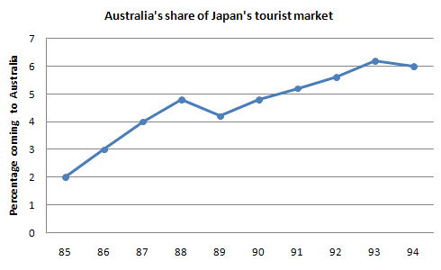
The charts below show the number of Japanese tourists travelling abroad between 1985 and 1995 and Australia’s share of the Japanese tourist market.
Summarise the information by selecting and reporting the main features, and make comparisons where relevant.

(Cambridge 3 – TEST 1)
A CANDIDATE’S ANSWER:
This is an answer written by a candidate who achieved a Band 5 score. Here is the examiner’s comment:
The writer does what is required of her in terms of task fulfilment, and the message can be followed, but the weaknesses in grammatical control and in spelling cause difficulty for the reader. Complex sentence structures are attempted, but the greatest levels of accuracy are found in basic, simple structures.
This chart shows us that Japanese tourists go abroad for travelling in a decade and Australian’s share of marketing for Japanese tourists. Between 1985 and 1995 Japanese tourists travelling abroad was dramatically increased. In 85 there was about 5 milions traveller go abroad. Since 85 number of traveller went up dramatically until 40. It was alomost twice then between 90 and 93 the number remain stateable, which is about 12 millions. From 93 to 95 it rose slightly. Therefore in 1995 there were about 15 millions people went abroad.
I am going to write about the other chart, which is Australian’s share of Japanese’s tourist market. This is also between 1985 and 1995. About 2 million Japanese tourist went to Australia in 1985. Between 85 and 89 people went there is increased sharply, which is almost 3 times more. In 1990 it fall number slightly but from 90 to 94 number is went up. However 94 to 95 is not so went up number of people who went to Australia. It rimain is the same or slightly decreased.
QUESTION PAPER 2The graph below shows the demand for electricity in England during typical days in winter and summer. The pie chart shows how electricity is used in an average English home.
Summarise the information by selecting and reporting the main features, and make comparisons where relevant.


REFERENCE ANSWER:
The presented graph illustrates the electricity requisition in England during two different seasons, winter and summer. Meanwhile, the pie chart demonstrates how the electricity is utilised daily and to what quantity.
In general, both in winter and summer, the electricity demand rises up from around 9:00 am to about 23:00 pm and the electricity in mainly spent for heating room and water.
Looking at the detail, the electricity demand in summer is reckoned between 10,000 – 20,000 units. It goes to around 12,000 before 9 am and slightly increases to around 20,000 at 14 pm and relatively fluctuates until the rest of the day. However, in winter, the electricity requisition sets about 35,000 units at 00 am and gradually spikes before it actually rises at 9 am and keeps the level swells until around 45,000 units at 23 pm.
Meanwhile, due to utilisation and quantity, heating room and water require the vast majority, 52%, of electricity using. This high proportion is related to the high electricity demand for these two appliances during winter. Whereas other kitchen and electronic devices, vacuum cleaners, food mixers and electronic tools amass lower proportion, 48%, than heating rooms and water.
QUESTION PAPER 3The chart below give information about travel to and from the UK, and about the most popular countries for UK residents to visit.
Summarise the information by selecting and reporting the main features, and make comparisons where relevant.
Visits to and from the UK

(Cambridge 4 – TEST 4)
MODEL ANSWER:
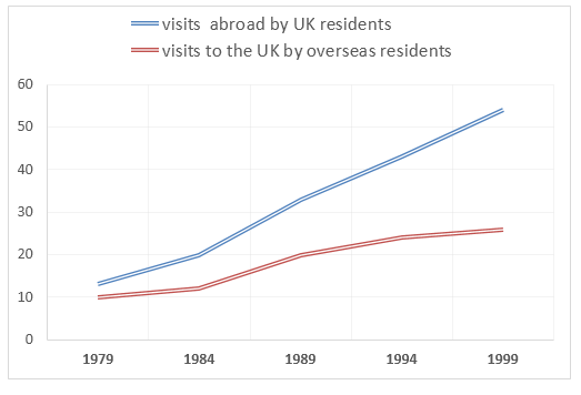
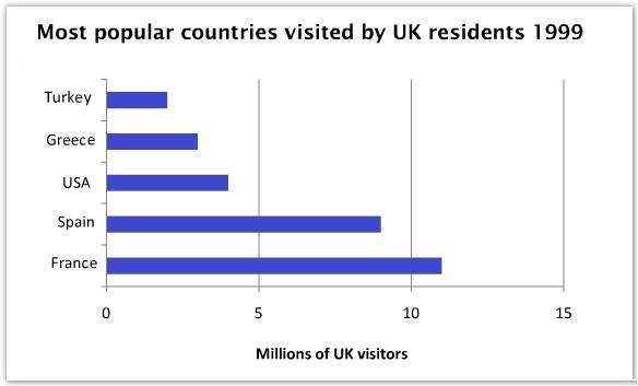
The illustration outlines how many foreign tourists travelled to the UK and how many UK residents went out to travel between 1979 and 1999. Moreover, it also shows where those UK citizens went in 1999.
Overall, the influx of tourists in the UK was fewer than the number of British who travelled outside, and France was their favourite destination.
In details, 10 million tourists visited the United Kingdom in 1979 while around 13 million British spent their holidays out of the country. From 1979 to 1999, the outbound UK residents’ number was higher than the inrush of foreign tourists in the UK. The gap widened in later years, and finally in 1999, almost 55 million British left the country to travel outside while just over 25 million other nationalities entered the UK border as tourists.
France was the favourite destination to British travellers as more than 10 million British travelled there in 1999. With around 2 million UK tourists, Turkey was their least preferred holiday place. Spain was visited by approximately 8 million UK travellers which made it the second most popular destination this year. USA and Greece received the third and fourth most-visited places by UK tourists with between 2 to 3 million tourists each.
QUESTION PAPER 4The graph and table below give information about water use worldwide and water consumption in two different countries.
Summarise the information by selecting and reporting the main features, and make comparisons where relevant.

Water consumption in Brazil and Congo in 2000
Country | Population | Irrigated land | Water consumption per person |
Brazil | 176 million | 26,500 km2 | 359 m3 |
Democratic Republic of Congo | 5.2 million | 100km2 | 8m3 |
(Cambridge 6 – TEST 1)
MODEL ANSWER:
The charts compare the amount of water used for agriculture, industry and homes around the world, and water use in Brazil and the Democratic Republic of Congo.
It is clear that global water needs rose significantly between 1900 and 2000, and that agriculture accounted for the largest proportion of water used. We can also see that water consumption was considerably higher in Brazil than in the Congo.
In 1900, around 500km³ of water was used by the agriculture sector worldwide. The figures for industrial and domestic water consumption stood at around one fifth of that amount. By 2000, global water use for agriculture had increased to around 3000km³, industrial water use had risen to just under half that amount, and domestic consumption had reached approximately 500km³.
In the year 2000, the populations of Brazil and the Congo were 176 million and 5.2 million respectively. Water consumption per person in Brazil, at 359m³, was much higher than that in the Congo, at only 8m³, and this could be explained by the fact that Brazil had 265 times more irrigated land.
REFERENCE ANSWER:
The graph shows how the amount of water used worldwide changed between 1900 and 2000.
Throughout the century, the largest quantity of water was used for agricultural purposes, and this increased dramatically from about 500 km3 to around 3,000 km3 in the year 2000. Water used in the industrial and domestic sectors also increased, but consumption was minimal until mid-century. From 1950 onwards, industrial use grew steadily to just over 1,000 km3, while domestic use rose more slowly to only 300 km3, both far below the levels of consumption by agriculture.
The table illustrates the differences in agricultural consumption in some areas of the world by contrasting the amount of irrigated land in Brazil (26,500 km2) with that In the D.R.C. (100 km2), This means that a huge amount of water is used in agriculture in Brazil, and this is reflected in the figures for water consumption per person: 359 m3 compared with only 8m3 in the Congo. With population of 176 million, the figures for Brazil indicate how high agricultural water consumption can be in some countries.
QUESTION PAPER 5The pie chart below shows the main reasons why agricultural land becomes less productive. The table shows how these affected three regions of the world during the 1990s.
Summarise the information by selecting and reporting the main features, and make comparisons where relevant.

(Cambridge 8 – TEST 1)
REFERENCE ANSWER:
This model has been prepared by an examiner as an example of a very good answer. However, please note that this is just one example out of many possible approaches
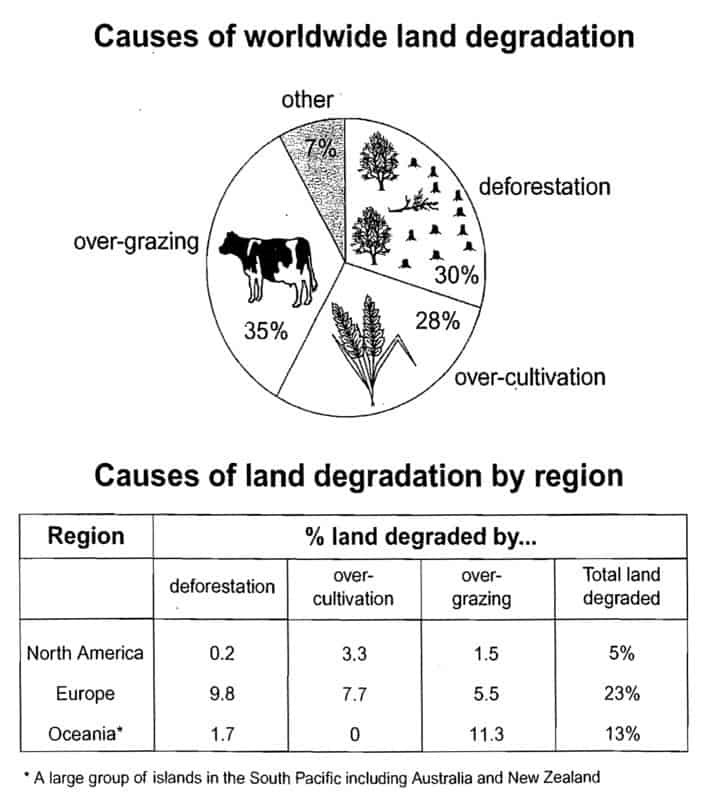
The pie chart shows that there are four main causes of farmland becoming degraded in the world today. Globally, 65% of degradation is caused by too much animal grazing and tree clearance, constituting 35% and 30% respectively. A further 28% of global degradation is due to over-cultivation of crops. Other causes account for only 7% collectively.
These causes affected different regions differently in the 1990s, with Europe having as much as 9.8% of degradation due to deforestation, while the impact of this on Oceania and North America was minimal, with only 1.7% and 0.2% of land affected respectively. Europe, with the highest overall percentage of land degraded (23%), also suffered from over-cultivation (7.7%) and over-grazing (5.5%). In contrast, Oceania had 13% of degraded farmland and this was mainly due to over-grazing (11.3%). North America had lower proportion of degraded land at only 5%, and the main causes of this were over-cultivation (3.3%) and, to a lesser extent, over-grazing (1.5%).
Overall, it is clear that Europe suffered more from farmland degradation than the other regions, and the main causes there were deforestation and over-cultivation.
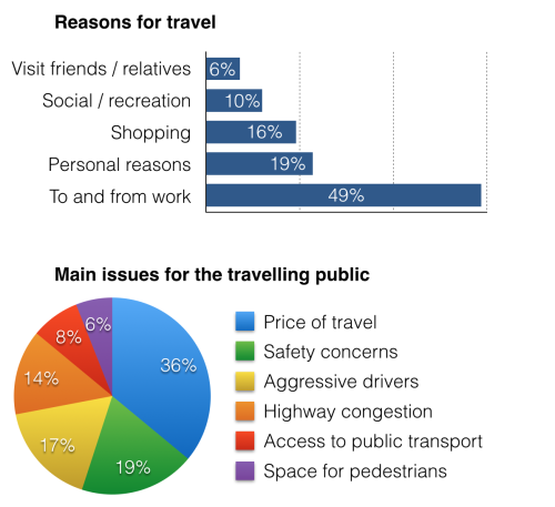
QUESTION PAPER 6The charts below show reasons for travel and the main issues for the travelling public in the US in 2009.

MODEL ANSWER:
The bar chart and pie chart give information about why US residents travelled and what travel problems they experienced in the year 2009.
It is clear that the principal reason why Americans travelled in 2009 was to commute to and from work. In the same year, the primary concern of Americans, with regard to the trips they made, was the cost of travelling.
Looking more closely at the bar chart, we can see that 49% of the trips made by Americans in 2009 were for the purpose of commuting. By contrast, only 6% of trips were visits to friends or relatives, and one in ten trips were for social or recreation reasons. Shopping was cited as the reason for 16% of all travel, while unspecific ‘personal reasons’ accounted for the remaining 19%.
According to the pie chart, price was the key consideration for 36% of American travellers. Almost one in five people cited safety as their foremost travel concern, while aggressive driving and highway congestion were the main issues for 17% and 14% of the travelling public. Finally, a total of 14% of those surveyed thought that access to public transport or space for pedestrians were the most important travel issues.
Sources:
Cambridge IELTS
Nội dung mặc định bạn muốn chèn vào editorThe charts below show the number of Japanese tourists travelling abroad between 1985 and 1995 and Australia’s share of the Japanese tourist market.
Summarise the information by selecting and reporting the main features, and make comparisons where relevant.
(Cambridge 3 – TEST 1)
A CANDIDATE’S ANSWER:
This is an answer written by a candidate who achieved a Band 5 score. Here is the examiner’s comment:
The writer does what is required of her in terms of task fulfilment, and the message can be followed, but the weaknesses in grammatical control and in spelling cause difficulty for the reader. Complex sentence structures are attempted, but the greatest levels of accuracy are found in basic, simple structures.
This chart shows us that Japanese tourists go abroad for travelling in a decade and Australian’s share of marketing for Japanese tourists. Between 1985 and 1995 Japanese tourists travelling abroad was dramatically increased. In 85 there was about 5 milions traveller go abroad. Since 85 number of traveller went up dramatically until 40. It was alomost twice then between 90 and 93 the number remain stateable, which is about 12 millions. From 93 to 95 it rose slightly. Therefore in 1995 there were about 15 millions people went abroad.
I am going to write about the other chart, which is Australian’s share of Japanese’s tourist market. This is also between 1985 and 1995. About 2 million Japanese tourist went to Australia in 1985. Between 85 and 89 people went there is increased sharply, which is almost 3 times more. In 1990 it fall number slightly but from 90 to 94 number is went up. However 94 to 95 is not so went up number of people who went to Australia. It rimain is the same or slightly decreased.
The graph below shows the demand for electricity in England during typical days in winter and summer. The pie chart shows how electricity is used in an average English home.
Summarise the information by selecting and reporting the main features, and make comparisons where relevant.

REFERENCE ANSWER:
The presented graph illustrates the electricity requisition in England during two different seasons, winter and summer. Meanwhile, the pie chart demonstrates how the electricity is utilised daily and to what quantity.
In general, both in winter and summer, the electricity demand rises up from around 9:00 am to about 23:00 pm and the electricity in mainly spent for heating room and water.
Looking at the detail, the electricity demand in summer is reckoned between 10,000 – 20,000 units. It goes to around 12,000 before 9 am and slightly increases to around 20,000 at 14 pm and relatively fluctuates until the rest of the day. However, in winter, the electricity requisition sets about 35,000 units at 00 am and gradually spikes before it actually rises at 9 am and keeps the level swells until around 45,000 units at 23 pm.
Meanwhile, due to utilisation and quantity, heating room and water require the vast majority, 52%, of electricity using. This high proportion is related to the high electricity demand for these two appliances during winter. Whereas other kitchen and electronic devices, vacuum cleaners, food mixers and electronic tools amass lower proportion, 48%, than heating rooms and water.
The chart below give information about travel to and from the UK, and about the most popular countries for UK residents to visit.
Summarise the information by selecting and reporting the main features, and make comparisons where relevant.
Visits to and from the UK
(Cambridge 4 – TEST 4)
MODEL ANSWER:
The illustration outlines how many foreign tourists travelled to the UK and how many UK residents went out to travel between 1979 and 1999. Moreover, it also shows where those UK citizens went in 1999.
Overall, the influx of tourists in the UK was fewer than the number of British who travelled outside, and France was their favourite destination.
In details, 10 million tourists visited the United Kingdom in 1979 while around 13 million British spent their holidays out of the country. From 1979 to 1999, the outbound UK residents’ number was higher than the inrush of foreign tourists in the UK. The gap widened in later years, and finally in 1999, almost 55 million British left the country to travel outside while just over 25 million other nationalities entered the UK border as tourists.
France was the favourite destination to British travellers as more than 10 million British travelled there in 1999. With around 2 million UK tourists, Turkey was their least preferred holiday place. Spain was visited by approximately 8 million UK travellers which made it the second most popular destination this year. USA and Greece received the third and fourth most-visited places by UK tourists with between 2 to 3 million tourists each.
The graph and table below give information about water use worldwide and water consumption in two different countries.
Summarise the information by selecting and reporting the main features, and make comparisons where relevant.

Water consumption in Brazil and Congo in 2000
|
Country |
Population |
Irrigated land |
Water consumption per person |
|
Brazil |
176 million |
26,500 km2 |
359 m3 |
|
Democratic Republic of Congo |
5.2 million |
100km2 |
8m3 |
(Cambridge 6 – TEST 1)
MODEL ANSWER:
The charts compare the amount of water used for agriculture, industry and homes around the world, and water use in Brazil and the Democratic Republic of Congo.
It is clear that global water needs rose significantly between 1900 and 2000, and that agriculture accounted for the largest proportion of water used. We can also see that water consumption was considerably higher in Brazil than in the Congo.
In 1900, around 500km³ of water was used by the agriculture sector worldwide. The figures for industrial and domestic water consumption stood at around one fifth of that amount. By 2000, global water use for agriculture had increased to around 3000km³, industrial water use had risen to just under half that amount, and domestic consumption had reached approximately 500km³.
In the year 2000, the populations of Brazil and the Congo were 176 million and 5.2 million respectively. Water consumption per person in Brazil, at 359m³, was much higher than that in the Congo, at only 8m³, and this could be explained by the fact that Brazil had 265 times more irrigated land.
REFERENCE ANSWER:
The graph shows how the amount of water used worldwide changed between 1900 and 2000.
Throughout the century, the largest quantity of water was used for agricultural purposes, and this increased dramatically from about 500 km3 to around 3,000 km3 in the year 2000. Water used in the industrial and domestic sectors also increased, but consumption was minimal until mid-century. From 1950 onwards, industrial use grew steadily to just over 1,000 km3, while domestic use rose more slowly to only 300 km3, both far below the levels of consumption by agriculture.
The table illustrates the differences in agricultural consumption in some areas of the world by contrasting the amount of irrigated land in Brazil (26,500 km2) with that In the D.R.C. (100 km2), This means that a huge amount of water is used in agriculture in Brazil, and this is reflected in the figures for water consumption per person: 359 m3 compared with only 8m3 in the Congo. With population of 176 million, the figures for Brazil indicate how high agricultural water consumption can be in some countries.
The pie chart below shows the main reasons why agricultural land becomes less productive. The table shows how these affected three regions of the world during the 1990s.
Summarise the information by selecting and reporting the main features, and make comparisons where relevant.
(Cambridge 8 – TEST 1)
REFERENCE ANSWER:
This model has been prepared by an examiner as an example of a very good answer. However, please note that this is just one example out of many possible approaches
The pie chart shows that there are four main causes of farmland becoming degraded in the world today. Globally, 65% of degradation is caused by too much animal grazing and tree clearance, constituting 35% and 30% respectively. A further 28% of global degradation is due to over-cultivation of crops. Other causes account for only 7% collectively.
These causes affected different regions differently in the 1990s, with Europe having as much as 9.8% of degradation due to deforestation, while the impact of this on Oceania and North America was minimal, with only 1.7% and 0.2% of land affected respectively. Europe, with the highest overall percentage of land degraded (23%), also suffered from over-cultivation (7.7%) and over-grazing (5.5%). In contrast, Oceania had 13% of degraded farmland and this was mainly due to over-grazing (11.3%). North America had lower proportion of degraded land at only 5%, and the main causes of this were over-cultivation (3.3%) and, to a lesser extent, over-grazing (1.5%).
Overall, it is clear that Europe suffered more from farmland degradation than the other regions, and the main causes there were deforestation and over-cultivation.
The charts below show reasons for travel and the main issues for the travelling public in the US in 2009.
MODEL ANSWER:
The bar chart and pie chart give information about why US residents travelled and what travel problems they experienced in the year 2009.
It is clear that the principal reason why Americans travelled in 2009 was to commute to and from work. In the same year, the primary concern of Americans, with regard to the trips they made, was the cost of travelling.
Looking more closely at the bar chart, we can see that 49% of the trips made by Americans in 2009 were for the purpose of commuting. By contrast, only 6% of trips were visits to friends or relatives, and one in ten trips were for social or recreation reasons. Shopping was cited as the reason for 16% of all travel, while unspecific ‘personal reasons’ accounted for the remaining 19%.
According to the pie chart, price was the key consideration for 36% of American travellers. Almost one in five people cited safety as their foremost travel concern, while aggressive driving and highway congestion were the main issues for 17% and 14% of the travelling public. Finally, a total of 14% of those surveyed thought that access to public transport or space for pedestrians were the most important travel issues.
0