

IELTS WRITING TASK 1 TECHNIQUES
July 11,2025
root
- The task will tell you to write a report, describing a graph, bar chart, pie chart, table, diagram or map.
- It is recommended that you spend only 20 minutes on this task.
- You must write 150 words or more.
- Your report should include an overview or summary of the information shown.
- It should also describe and compare the key details.
-
Understand the task
-
Break the task into parts
-
Methods, techniques and demonstration of methods and techniques
-
Lots of practice
-
Feedback, measure progress (give feedback on students’ performance and how to improve, give tests for students’ self assessment and teacher assessment)
Here are the six question types that we need to prepare for:
-
Line graph
-
Bar chart
-
Pie chart
-
Table
-
Diagrams / maps that compare things
-
Diagrams that show a process
Here is a suggested structure for task 1
- Introduction: 1-2 sentences – what does/do the chart(s)/diagram(s)/maps show?
- Overview (summary): 2 sentences – what are the most noticeable features?
- First ‘details’ paragraph: 3-4 sentences – describing specific facts or figures
- Second ‘details’ paragraph: 3-4 sentences – describing specific facts or figures.
It’s fine to write more than the number of sentences above. However, this structure will help you produce a concise report.
The introduction should be simple and clear: The chart shows… (or compares or illustrates).
Why should you write an overview, but not a conclusion? What’s the difference between a conclusion and an overview?
First, a conclusion is a final judgement, decision or opinion. This is perfect for the task 2 essay, but task 1 asks you to write a description without analysis or opinions. On the other hand, an “overview” is a simple description of the main points. It is a summary of the information shown on the graph or chart.
Second, a conclusion should be at the end of a piece of writing. An overview or general summary could go either at the end or near the beginning. It’s a good idea to describe the main features of the graph or chart near the beginning of your report.
When writing a task 1 report, you don’t need to worry much about ‘grammatical range’ because:
- First, how many different ‘grammatical structures’ can we really use in the space of only 8 or 9 sentences?
- Second, do we have time to think about including an example of a passive, a conditional, various types of clause etc.?
- Third, will these different structures be relevant? Will they work in the context of the description?
It’s much more important to spend the 20 minutes thinking about how best to describe the information on the chart in a clear and logical way. In other words, you should focus on task response, coherence and accuracy. This is what examiners are really looking for in task 1. This is particularly true for graph/chart/table question types. With diagram and map types of questions, you will have more opportunities to show grammatical range.
In IELTS writing task 1 answers, you’ll see that the verbs are often not difficult verbs (e.g. were, was, rose, attended, made), but there are lots of big noun phrases (e.g. hospital emergency wards, emergency care attendances, those aged 65 to 74, insulation and thermal building materials, insulation and reflective materials, the site of the original sports field, the main entrance to the second car park…).
You have 20 minutes for task 1, so try spending 5 minutes on each paragraph. This might help you to organise your time better.
First 5 minutes
Read the question, make sure you understand the chart, highlight key information, then write your introduction by paraphrasing the question.
Second 5 minutes
Look at the chart and try to find 2 general points. Don’t look at specific details; look for “the big picture”. Write 2 sentences summarising the information.
Final 10 minutes
Describe specific details. Try to break this part into 2 paragraphs because it looks better. You could spend 5 minutes on each paragraph. Aim to write 3 sentences for each paragraph.
- Know what the six types of question are (e.g. line graph…).
- Try several real test examples of each type.
- Know the 4-paragraph method suggested here.
- Practise paraphrasing the question to write introductions.
- Understand why we don’t write a conclusion for task 1.
- Know how to write an ‘overview’, and what to include in this paragraph.
- Practise selecting key information, rather than describing everything.
- Be able to write good ‘comparing’ sentences.
- Be able to describe changes and trends (e.g. increase, decrease).
- Be able to use the passive to describe steps in a process.
Help students understand the task
- Understand the marking criteria of task 1 (See Appendix I)
- Obtain an overview of the different types of questions they might face. It’s good to have a ‘pack’ of questions printed out that includes: a line graph, bar chart, pie chart, table, 2 different charts, 3 or more similar charts, process diagram, comparison diagram, life cycle, map. (See Appendix II)
- When approaching any task, analyze it. From the task statement, the charts, graphs, table, diagrams, maps, identify key features: trends, changes, similarities, differences…, how to select what to report.
Break the task into parts. Pratise part of reports
Instead of writing a full report, try writing introductions. The next time, just focus on writing overviews. On a different day, practise describing percentages, or comparing numbers etc… Start writing a whole report once students have become familiar with and comfortable writing the parts.
Guide them through the methods and techniques explained below. Demonstrate the methods and techniques.
There are examples for the methods and techniques in this material to support teachers. They are all written by an examiner as examples of band 8 or 9 answers. However, teachers should also demonstrate to students by writing themselves.
Give them lots of practice
From controlled to freer practice: gap fill, error correction, sentence completion, writing sentences with prompts, writing sentences without prompts, writing paragraph, writing a whole report.
Give students regular feedback and measure progress
A. CHART
Look at the writing task 1 band descriptors for “task achievement”, and you’ll see the following points:
Band 5 = no clear overview
Band 6 = presents an overview
Band 7 = presents a clear overview
So, if you want a high score, your overview needs to be good. This is why a separate overview paragraph with two sentences is recommended.
Many people have no trouble describing specific details, but they find it difficult to describe the general features of a graph, chart or diagram.
Some tips on how to write a good overview:
1.1 Always try to write two sentences. This forces you to describe two main or general features of the graph, chart or diagram.
Are two points always enough for the overview? Can we add a third point?
It’s best to stick to just two main or general points, even if you can see other general trends that could be mentioned. Here are four reasons: First, it’s better to describe two things well and then move on to the details. Second, the overview would lose its impact if it becomes too long – it stops being a summary. Third, one of the requirements of task 1 is that you “select” information; you are not expected to describe everything. Finally, it’s better to have a method and stick to it, so you know what to do without having to think too much, especially given the limited amount of time in the real test.
1.2. Don’t put any numbers in your overview. Save specific numbers for the ‘details’ paragraphs.
1.3. If the graph or chart shows a time period (e.g. years), look for the overall change from the beginning to the end of the period (e.g. from the first year to the last year).
1.4. Look for overall trends, and ignore individual figures that don’t fit the trend. For example, if a graph shows a rising trend overall, you can ignore a specific year when the figures decreased – save that year for your ‘details’ paragraphs.
1.5. If no time period is shown, you can’t look for trends. Instead, look for differences and similarities between items.
1.6. Don’t look for individual ‘highest’ or ‘lowest’ figures such as a ‘peak’ on a line graph. Instead, describe the highest and lowest items overall (e.g. which line on the graph was the highest for the whole or most of the period?).
1.7. Start your overview with a simple phrase that clearly shows the examiner that this is your summary paragraph e.g. It is clear that… , It is noticeable that… , Overall we can see that…
1.8. If there are two different charts, write one overview sentence about each chart. (as in the example below.
1.9. If there are more than two charts, they must be connected in some way, so look for two main features overall.
1.10. If the task is to describe a diagram or map that compares things, you can mention the main differences and maybe the number of differences and / or similarities between the two diagrams.
1.11. If the task is to describe a process diagram, you can mention the total number of stages in the process and say where or how the process begins and ends.
Where to put the ‘overview’
Students can choose where to put the overview. It’s fine to put it after the introduction, and it’s fine to put it at the end.
However, there are 2 reasons why it is recommended to put the overview after the introduction, rather than at the end:
- It would be easier and more logical to begin with the general information and main features before describing specific details.
The overview is very important, so we should prioritise it. If you want a high score, your overview / summary needs to be good, not something that you write in a hurry when your time is running out.
How to identify key features / trends
Before you write your overview, you need to identify the key features, trends or differences. Look at the ‘big picture’ rather than small details, and summarise the information without mentioning any numbers.
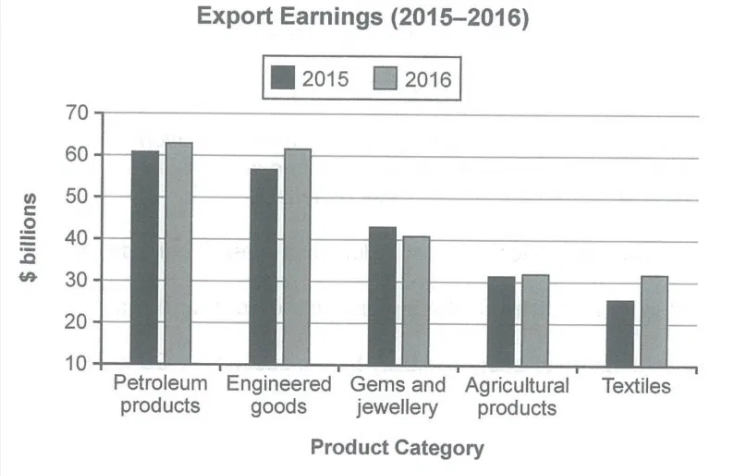
Example 1:
Here’s a two-sentence overview, describing the key features:
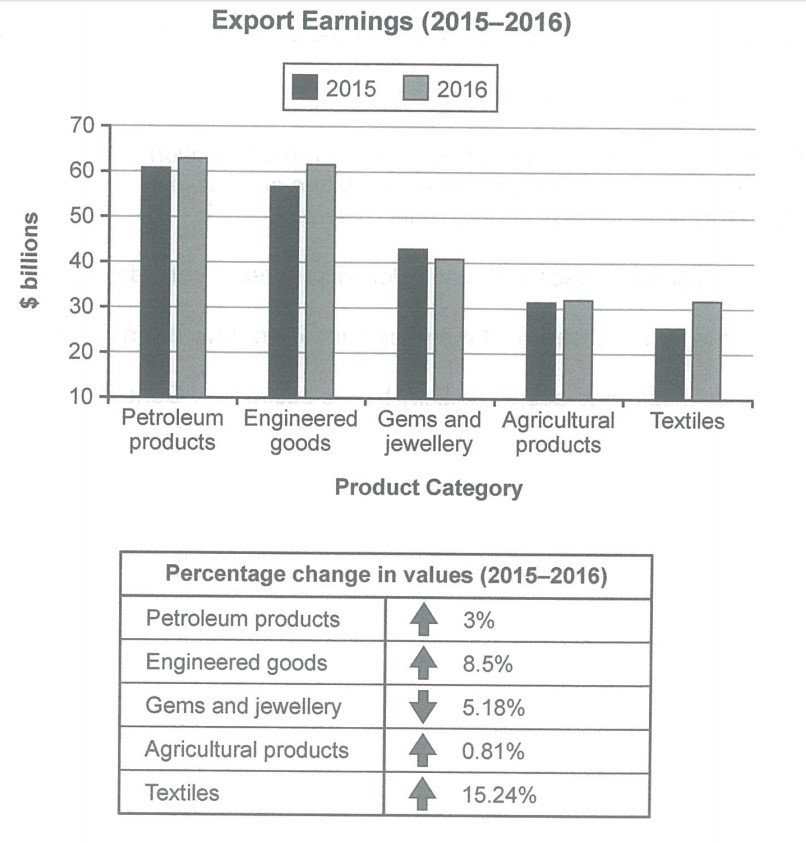
It is noticeable that export revenues in all but one of the five product categories rose over the period shown. While petroleum products were the highest earning exports in both years, the textile industry saw the most significant growth in earnings.
Example 2:
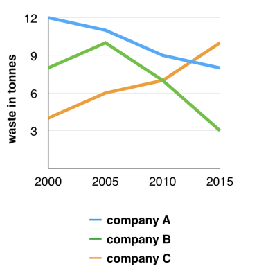
The graph below shows the amounts of waste produced by three companies over a period of 15 years.
What trends can you notice?
Here are some main points:
- There were significant changes in the amounts of waste produced by all three companies.
- Waste produced by companies A and B decreased, but waste produced by company C increased.
- Company A was the biggest waste producer at the beginning of the period, but C was the biggest producer by the end of the period.
- Company A produced the largest amount of waste in total.
You should choose just two most noticeable of these main points for a two-sentence overview paragraph. For example:
It is clear that there were significant changes in the amounts of waste produced by all three companies shown on the graph. While companies A and B saw waste output fall over the 15-year period, the amount of waste produced by company C increased considerably.
Example 3:
Did you notice the 80%?
Let’s try looking for the “big picture” in some data. We can then write a good overview or summary.
The charts below show the proportions of British students at one university in England who were able to speak other languages in addition to English, in 2000 and 2010.
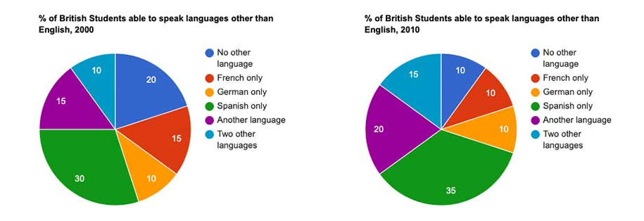
(Cambridge IELTS book 11 Test 2)
Percentage of students able to speak languages other than English:
30% – Spanish
15% – French
10% – German
15% – another language (not Spanish, French or German)
10% – two other languages
20% – no other language
Writing your overview / summary paragraph:
It’s very clear that we will notice the biggest number straight away (30% – Spanish), and we could certainly mention this in our overview. Many people then look for the smallest number, but there is something better that we can mention: the 80% of students who are able to speak at least one foreign language. Did you notice the 80%?
Here’s an example 2-sentence overview / summary:
It is noticeable that the vast majority of students are able to speak at least one foreign language, as well as English. We can also see that Spanish is the most widely spoken second language among the surveyed group of students.
PS. In order not to include specific numbers in the summary, see how these numbers are represented based on the information on the chart.
‘vast majority’ – instead of 80%
‘most widely spoken second language’ – instead of 30%.
The specific figures can be added in the “details” paragraphs.
Example 4:
The pie charts below compare water usage in San Diego, California and the rest of the world.
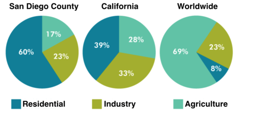
Introduction (just paraphrase the question):
The pie charts give information about the water used for residential, industrial and agricultural purposes in San Diego County, California, and the world as a whole.
Overview (describe two main, general features):
It is noticeable that more water is consumed by homes than by industry or agriculture in the two American regions. By contrast, agriculture accounts for the vast majority of water used worldwide.
Example 5:
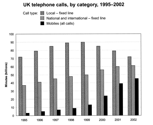
The chart below shows the total number of minutes (in billions) of telephone calls in the UK, divided into three categories, from 1995-2002.
Note:
Challenges for students doing Writing Task 1:
– How to read the data / information on charts, diagrams, maps; identify the main features.
– How to express their ideas with correct and appropriate language.
Teachers can see examples of students’ mistakes below.
- The bar chart illustrates that the trend of call types in the united kingdom for 8 years from 1995 to 2002.
- The bar chart compares the figures in terms of minutes spent on telephone calls, splitted into three types.
- The bar chart gives information about telephone calls. It is in three types Local, National & International and Mobile call minutes from year 1995 to 2002 in UK.
- The graph compares the total using time of 3 call types in the UK over a 7-year period from 1995.
- The bar chart presents the amount of phone calls in billion of minutes make in the UK over a period of seven years into the categories of local, national/international and mobile phone calls.
The course should aim at helping students improve towards something like this example.
The bar chart compares the amount of time spent by people in the UK on three different types of phone call between 1995 and 2002.
It is clear that calls made via local, fixed lines were the most popular type, in terms of overall usage, throughout the period shown. The lowest figures on the chart are for mobile calls, but this category also saw the most dramatic increase in user minutes.
Example 6:
The bar chart below shows the percentage of Australian men and women in different age groups who did regular physical activity in 2010.
Summarise the information by selecting and reporting the main features, and make comparisons where relevant.
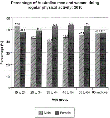
Before we describe the chart, let’s get one important thing right: ‘the big picture’. In other words, think about the information that you would put in your overview / summary paragraph.
Try to answer the following questions:
- What was the overall percentage (i.e. average or range) of all Australian men and womenwho did regular physical activity in 2010?
- Are there any differences between the figures for men and women, looking at all age groups?
- Were any age groups noticeably more (or less) active than the others?
Remember: Many IELTS candidates fail to write a good overview of the information in writing task 1. We need to practise looking at the ‘big picture’.
Suggestions for an introduction and overview:
The chart compares the proportions of Australian males and females in six age categories who were physically active on a regular basis in the year 2010.
Roughly speaking, close to half of Australian adults did some kind of routine physical activity in 2010. Middle aged females were the most physically active, proportionally, while males aged 35 to 44 did the least physical activity.
Sentence analysis:
Sentence 1
The purpose of this sentence is to begin the description by stating what the bar chart shows. The main feature of the sentence is the paraphrasing (of the question statement) that it contains:
- The bar chart = the chart
- shows = compares
- the percentage of = the proportions of
- men and women = males and females
- in different age groups = in six age categories
- did regular physical activity = were physically active on a regular basis
- in 2010 = in the year 2010
Sentence 2
The purpose of this sentence is to give a general overview of the information, by describing an overall trend. Some useful language:
- roughly speaking – a nice way to introduce an approximate overall trend
- close to half of Australian adults – grouping men and women in all age categories together, in order to describe an overall trend
- some kind of routine physical activity – paraphrasing ‘regular physical activity’
Sentence 3
The purpose of this sentence is to continue the overview by highlighting the highest and lowest figures on the chart. Some useful language:
- Middle aged females – more than one age category grouped together
- the most physically active – highlighting age categories with the highest figures
- proportionally – this word is necessary because the figures show percentages of people in each age group, not raw numbers
- while males – contrasting with the statement about females
- the least physical activity – contrasting the highest with the lowest.
Example 7:
The tables below give information about sales of Fairtrade*-labelled coffee and bananas in 1999 and 2004 in five European countries.
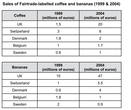
Fairtrade:
a category of products for which farmers from developing countries have been paid an officially agreed fair price.
Look at the task and choose two main / general points. Can you write a two-sentence summary in 5 minutes or less?
Suggestion:
It is clear that sales of Fairtrade coffee rose in all five European countries from 1999 to 2004, but sales of Fairtrade bananas only went up in three out of the five countries. Overall, the UK saw by far the highest levels of spending on the two products.
Example 8:
How would you write an overview of the information in the bar chart below?
How would you read the data?
You could look at two things: 1) every year 2) across the years.
- In every year:what can we say was true in all three years on the chart? One possible answer: most Americans ate in fast food restaurants between once a week and once a month (the two middle categories have the highest bars in all three years).
- Across the years:is there a change or trend across the 10-year period? One possible answer: Americans ate in fast food restaurants less frequently in 2013 (once or twice a month instead of once a week).
Here’s an overview paragraph using the ideas above:
It is clear that the majority of Americans ate in fast food restaurants between once a week and once a month in all three years shown on the chart. We can also see that there was a shift towards eating in these restaurants less frequently by the end of the 10-year period.
Example 9:
Look again at the chart below, and think about what you would write in your ‘overview’ paragraph. Choose two main or general points.
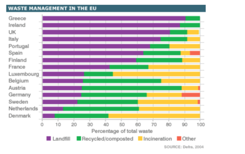
The chart below compares levels of recycling, as well as some less environmentally friendly forms of waste management, in fifteen European countries.
Here’s a tip:
It’s normally suggested that you look for something very general, like an overall trend, for the overview. However, if you’re stuck, it’s ok to choose the highest and lowest. See the example below.
Here’s a 2-sentence “highest and lowest” overview using the tip above:
It is noticeable that Austria is the most environmentally friendly country, in the sense that it recycles the largest percentage of waste. By contrast, Greece stands out as the country that recycles the least and puts the highest proportion of its waste into landfill.
Instead of writing about the “highest and lowest” figures, let’s describe something more general. For example, landfill seems to be the most popular form of waste management overall, and only two countries (Austria and Belgium) recycle at least 50% of their waste.
Here’s a more general overview:
If we look at the fifteen EU countries as a whole, it is clear that more waste goes to landfill sites than to any other refuse management facility. In fact, while around half of the countries put the majority of their waste into landfill sites, only two countries recycle at least half of the waste that they produce.
Which one do you think is better?
Example 10:
Here are two ‘overview’ paragraphs for the table above. Which do you prefer?
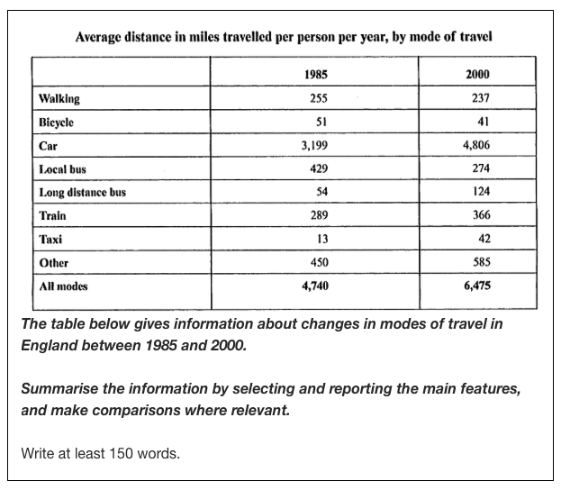
Overview 1
It is clear that the car was by far the most used mode of travel in both years. Overall, English people travelled significantly more in 2000 than in 1985.
Overview 2
It is clear that the total number of miles travelled by English people using all modes of transport increased significantly between 1985 and 2000. The car was by far the most used form of transport in both years.
Example 11:
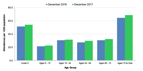
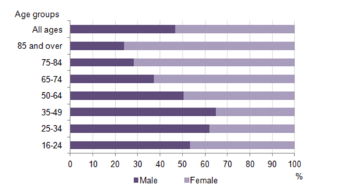
Look at the bar chart below, and try writing a 2-sentence overview:
– One sentence that compares the two months (the blue and green bars).
– One sentence describing the overall trend by age group.m
The chart below shows figures for attendances at hospital emergency care departments in Northern Ireland by age group in December 2016 and December 2017.
Attendances at emergency care departments per 1000-population
After writing your introduction and overview, you should try to write two more paragraphs to describe the most important details that you can see on the graph, chart or diagram.
Main paragraph decisions
- Paragraph ‘grouping’
To describe information on graphs, charts, tables, etc., you should select information, and group it.
It would be good to create two information groups, so that you can write two separate ‘details’ paragraphs.
Example 1:
Here’s an example of one ‘details’ paragraph. This paragraph describes the highlighted information.
Average distance in miles travelled per person per year, by mode of travel
|
|
1985 |
2000 |
|
Walking |
255 |
237 |
|
Bicycle |
51 |
41 |
|
Car |
3,199 |
4,806 |
|
Local bus |
429 |
274 |
|
Long distance bus |
54 |
124 |
|
Train |
289 |
366 |
|
Taxi |
13 |
42 |
|
Other |
450 |
585 |
|
All modes |
4,740 |
6,475 |
Here’s an example paragraph about the ‘highlighted’ data:
In 1985, the average person travelled 3,199 miles by car, and this rose to 4,806 miles in the year 2000. The figures for miles travelled by train, long distance bus, taxi and other modes also increased from 1985 to 2000. Travel by taxi saw the most significant change, with more than a threefold increase from 13 miles per person per year in 1985 to 42 miles in 2000.
Analysis questions:
- Did the writer mentionevery mode of travel highlighted in yellow?
- How many numbers did the writer mention specifically?
- Which modes of travel did the writer choose to focus on, and why?
Here’s a full sample answer.
The chart shows average distances that people in England travelled using different forms of transport in the years 1985 and 2000.
It is clear that the total number of miles travelled by English people using all modes of transport increased significantly between 1985 and 2000. The car was by far the most used form of transport in both years.
In 1985, the average person travelled 3,199 miles by car, and this rose to 4,806 miles in the year 2000. The figures for miles travelled by train, long distance bus, taxi and other modes also increased from 1985 to 2000. Travel by taxi saw the most significant change, with more than a threefold increase from 13 miles per person per year in 1985 to 42 miles in 2000.
Here’s the second “details” paragraph, which focuses on the falling trend among the remaining modes:
There was a fall in the average distances for three forms of transport, namely walking, bicycle and local bus. In 1985, English people walked an average of 255 miles, but this figure fell by 18 miles in 2000. Bicycle use fell from 51 to 41 miles over the period shown, while the biggest downward change was in the use of local buses, with average miles per person falling from 429 to 274 over the 15-year period.
Example 2:
Looking again at the table below, one problem that we have is how to separate the information into two groups, for paragraphs 3 and 4.
Examiners like comparisons, so you’d better not write a separate paragraph for each table. Because the countries and the years are the same, you should try to compare the information in the two tables.
So how can we separate the information in a different way?
Suggestion:
- Paragraph 3: Write about sales of both products in the UK and Switzerland (which have the highest figures).
- Paragraph 4: Say something about sales of the two products in the other three countries.
The tables show the amount of money spent on Fairtrade coffee and bananas in two separate years in the UK, Switzerland, Denmark, Belgium and Sweden.
It is clear that sales of Fairtrade coffee rose in all five European countries from 1999 to 2004, but sales of Fairtrade bananas only went up in three out of the five countries. Overall, the UK saw by far the highest levels of spending on the two products.
In 1999, Switzerland had the highest sales of Fairtrade coffee, at €3 million, while revenue from Fairtrade bananas was highest in the UK, at €15 million. By 2004, however, sales of Fairtrade coffee in the UK had risen to €20 million, and this was over three times higher than Switzerland’s sales figure for Fairtrade coffee in that year. The year 2004 also saw dramatic increases in the money spent on Fairtrade bananas in the UK and Switzerland, with revenues rising by €32 million and €4.5 million respectively.
Sales of the two Fairtrade products were far lower in Denmark, Belgium and Sweden. Small increases in sales of Fairtrade coffee can be seen, but revenue remained at €2 million or below in all three countries in both years. Finally, it is noticeable that the money spent on Fairtrade bananas actually fell in Belgium and Sweden.
Note:
This report is a bit longer (216 words) than necessary, but it’s a useful model answer in terms of its structure and the language used.
2. Expand on the two points in the overview
When the graph, chart or table shows a lot of information, it’s difficult to decide what to put in your main ‘details’ paragraphs.
Here’s a method you can use to make this decision: expand on the two points that you made in your ‘overview’ paragraph.
Example 1:
The table below gives information about the problems faced by children in two primary schools in 2005 and 2015.
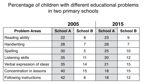
The table compares two primary schools in terms of the proportions of their pupils who experienced seven different educational problems in the years 2005 and 2015.
It is noticeable that school A had higher proportions of children with all seven educational difficulties in both years. However, while school A managed to reduce the incidence of most of the problems between 2005 and 2015, school B saw an overall rise in the percentage of children who were struggling.
Paragraph 3
Expand on the sentence about school A having higher proportions of children with educational problems. In other words, we can make some easy comparisons between school A and B. Don’t worry about changes in the figures or comparing the two years.
Paragraph 4
Now expand on the sentence about changes i.e. falling percentages in school A and rising figures in school B.
Here’s an example:
In 2005, 42% of school A’s pupils found it difficult to follow instructions, whereas only 6% of pupils in school B experienced this problem. Similarly, between 30 and 40 per cent of children attending school A had problems in the areas of spelling, listening, verbal expression and concentration in lessons, while the equivalent figures for school B stood at between 5 and 15 per cent.
In 2015, the difference between the two schools was less pronounced. Notably, the proportion of children who struggled to follow instructions fell by 24% in school A, and this school also saw falls of 22%, 15%, 14% and 5% in the figures for children who had problems with concentration, listening, verbal expression and spelling. In school B, however, the proportion of children who struggled with spelling and following instructions doubled, to 10% and 12% respectively, and there was almost no change in the incidence of listening, verbal or concentration problems.
Example 2:
The bar chart illustrates the frequency with which Americans ate in fast food establishments from 2003 to 2013.
(Source: Cambridge IELTS 12)
It is clear that the majority of Americans ate in fast food restaurants between once a week and once a month in all three years. We can also see a shift towards eating in these restaurants less frequently by the end of the 10-year period.
In each of the years shown on the chart, close to 60% of people in the US ate in fast food restaurants between once and four times a month. Roughly 15 to 20% of Americans reported eating in fast food outlets several times per week, while 3 to 4% of people ate in these outlets daily. At the other end of the scale, around 4% of people avoided fast food restaurants completely.
Between 2006 and 2013, the total proportion of Americans who ate in fast food establishments either once a week or several times a week fell by almost 10%. At the same time, there was an increase of around 8% in the ‘once or twice a month’ category. In other words, the weekly fast food habit that was common in 2003 and 2006 became a monthly or twice monthly habit in 2013.
Can you see the cohesion in paragraphs 3 & 4 and the overview?
A few things to remember with regard to this ‘super cohesion’ technique:
- You’ll need to practise this way of writing many times before you become confident enough to use it in a real exam.
- This technique is a nice option, but it’s not something that you must do
‘Details’ paragraphs: only 6 sentences (3 sentences each)!
After you’ve written the introduction and overview, you should aim to write just 6 sentences describing specific information (you can write more but 6 would be good).
Example 1:
The graph below shows the average daily spend of three categories of international visitor to New Zealand from 1997 to 2017.…
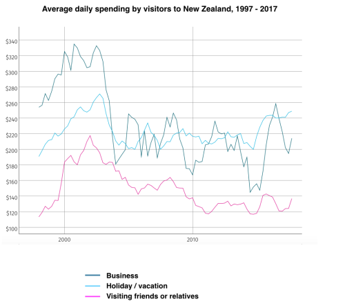
Introduction
The line graph compares three types of traveller to New Zealand between 1997 and 2017 in terms of their average daily expenditure.
Overview
It is noticeable that spending by these international visitors was at its highest between the years 2000 and 2003. Overall, business travellers spent the most per day, while people visiting friends or relatives spent the least.
Paragraph 3
- Compare all three lines in 1997.
- Compare the trends between 1997 and 2002/3.
- Say what happened in 2003 – 2005.
Paragraph 4
- Compare the figures for ‘business’ and ‘holiday’ visitors from 2005 to 2015.
- Contrast the above with the figures for ‘visiting friends or relatives’.
- Compare all three lines in 2017.
In 1997, business visitors to New Zealand spent an average of almost $260 per day, while holidaymakers spent around $190 and people visiting friends or relatives spent less than $120. Over the following five years, spending by all three types of traveller increased dramatically, to peaks of around $330, $270 and $220. However, visitor spending suddenly fell again between 2003 and 2005.
From 2005 to 2015, the daily expenditure of business travellers and tourists fluctuated around the $200 mark, whereas people visiting relations or friends spent roughly 60 to 80 dollars less per day. By 2017, daily spending had risen to approximately $250, $210 and $140 respectively for vacationers, business people and those visiting loved ones.
(174 words)
Example 2:
The chart below shows how frequently people in the USA ate in fast food restaurants between 2003 and 2013.

(Source: Cambridge IELTS 12)
Here’s a full sample answer. Fill the gaps to complete it.
The bar chart illustrates the frequency with ______ Americans ate in fast food establishments from 2003 to 2013.
It is clear that the majority of Americans ate in fast food restaurants between once a week and once a month in all three years. We can also see a shift ______ eating in these restaurants less frequently by the end of the 10-year period.
In each of the years shown on the chart, ______ to 60% of people in the US ate in fast food restaurants between once and four times a month. Roughly 15 to 20% of Americans ______ eating in fast food outlets several times per week, while 3 to 4% of people ate in these outlets daily. At the other ______ of the scale, around 4% of people avoided fast food restaurants completely.
Between 2006 and 2013, the total proportion of Americans who ate in fast food establishments either once a week or several times a week ______ by almost 10%. At the same time, there was an ______ of around 8% in the ‘once or twice a month’ category. In other words, the weekly fast food habit that was ______ in 2003 and 2006 became a monthly or twice monthly habit in 2013.
Use the following words:
end, close, increase, which, reported, common, towards, fell
(Key: which, towards, close, reported, end, fell, increase, common)
Line graph ‘details’ tips
Here are some tips for describing line graph ‘details’ paragraphs:
3.1 Try to write two paragraphs. This isn’t a ‘rule’, but it’s a good idea because it forces you to group the information, and this should improve the organisation and coherence of your report. One big paragraph full of numbers can look messy, whereas two separate paragraphs will look neater and be easier to read.
3.2 Aim for just three or four sentences in each ‘details’ paragraph. Sometimes, your sentences can be long because you compare several numbers, then two sentences could be enough.
3.3 Always compare the lines; never describe each line separately because, firstly, you’re asked to make comparisons; secondly, if you describe each line separately, your description would sound “mechanical”: sentences would just follow an “It did this, then it did this” format, as in the example below.
In 1997, the top spending category (at $260) was business visitors. It rose by about a third to peak in 2002/3, and then dropped by nearly half. In the decade to 2015, it fluctuated wildly but the trend remained flat.
- Select key numbers only. You won’t have time to describe every number in every year.
3.5 Paragraph 3: Compare the lines (giving numbers) in the first year shown, then describe any significant numbers or overall trends in the first half of the time period.
3.6 Paragraph 4: Describe any significant numbers or overall trends in the second half of the time period, then compare the lines (giving numbers) in the last year shown.
Example:
The graph below shows changes in global food and oil prices between 2000 and 2011.
World Food & Oil Prices 2000 to 2011
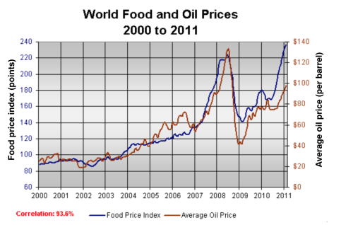
A sentence about the year 2000:
In the year 2000, the average global oil price was close to $25 per barrel, and the food price index stood at just under 90 points.
A sentence about the years 2000 to 2007:
Over the following four years both prices remained relatively stable, in spite of frequent small fluctuations, before rising steadily between 2004 and 2007.
A sentence about the year 2007:
By 2007, the average oil price had more than doubled, to nearly $60 per barrel, and food prices had risen by around 50 points.
A sentence about the years 2007 to 2008:
A dramatic increase in oil and food prices was seen from 2007 to 2008, with oil prices reaching a peak of approximately $130 per barrel and the food price index rising to 220 points.
A sentence about the year 2009:
By the beginning of 2009 the price of oil had dropped by roughly $90, and the food price index was down by about 80 points.
Task:
Can you write one correct sentence about oil and food prices in 2011?
The graph below shows changes in global food and oil prices between 2000 and 2011.
Here’s a full sample answer:
The line graph compares the average price of a barrel of oil with the food price index over a period of 11 years.
It is clear that average global prices of both oil and food rose considerably between 2000 and 2011. Furthermore, the trends for both commodities were very similar, and so a strong correlation (93.6%) is suggested.
In the year 2000, the average global oil price was close to $25 per barrel, and the food price index stood at just under 90 points. Over the following four years both prices remained relatively stable, before rising steadily between 2004 and 2007. By 2007, the average oil price had more than doubled, to nearly $60 per barrel, and food prices had risen by around 50 points.
A dramatic increase in both commodity prices was seen from 2007 to 2008, with oil prices reaching a peak of approximately $130 per barrel and the food price index rising to 220 points. However, by the beginning of 2009 the price of oil had dropped by roughly $90, and the food price index was down by about 80 points. Finally, in 2011, the average oil price rose once again, to nearly $100 per barrel, while the food price index reached its peak, at almost 240 points.
Avoid common mistakes
Here’s some advice to help you avoid common mistakes in IELTS writing task 1:
- Don’t copy the question for your introduction. You should paraphrasethe question (i.e. rewrite it using some different words).
- Don’t forget to separate your paragraphs clearly.
- Don’t forget to write a good summary/overview of the information.
- Don’t describe items separately (e.g. 2 lines on a graph). You should always try to compare things if it is possible to do so. Instead of describing 2 lines separately, compare the 2 lines at key points.
P/S If you see a question that shows a graph with only 1 line, don’t waste time practicing because there won’t be such a question in the real exam.
- Don’t try to describe every number on a chart or graph (unless there are only a few numbers). A key skill in task 1 is being able to select the key information and describe or compare it well.
Don’t spend longer than 20 minutes on task 1. Practise spending 5 minutes on each of your 4 paragraphs. Stop yourself after 20 minutes; remember that task 2 is worth more marks.
IELTS Writing Task 1: the most important skill
Probably the most important skill for writing task 1 is being able to describe numbers correctly. IELTS candidates make a lot of basic mistakes in this area.
Take the simple table below for example. It shows the percentages of people who used two different forms of communication in the year 2012.
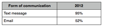
Can you write one correct sentence to describe the numbers in the table? Don’t make mistakes like this:
In 2012, text message was 95%, while email was only 52%.
Can you see what the problem is here? Does the sentence make sense?
You need to work on:
- Writing a sentence about one particular number.
- Writing a sentence that compares two numbers.
- Writing a sentence that describes a change.
Example:
Take this information for example (from a question in Cambridge book 10):
- year 1999
- Switzerland
- highest sales of Fairtrade coffee and bananas
- Fairtrade coffee sales: 3 million Euros
- Fairtrade banana sales: 15 million Euros
Can you write one correct sentence that contains this information
VARIETY AND REPETITION
In writing task 1, there will probably be one or two key words or phrases that you find yourself repeating in almost every sentence. For example, the word “price” is mentioned a number of times in the writing on “World food & oil prices”.
Add variety where you can
You should try to add some variety where you feel an alternative word or phrase works well. If it doesn’t, you will confuse the reader.
Repetition can also be positive
In Writing task 1, you shouldn’t be too worried about repeating the KEY ideas (the example of “price” above) a few times. It can help the coherence of your writing if a key word or phrase is repeated, because this helps the reader to make connections between ideas in different sentences. Too much variety can confuse the reader. For example, it will seem very strange if you use 10 different synonyms for a word like “spending”.
Remember: variety is good, but repetition is also normal.
SOME SPECIAL CHARTS
Pie chart with extra detail
Let’s try to write a report about the pie chart below. First, can you write an introduction without having a question statement to help you?
Here’s a full sample answer.
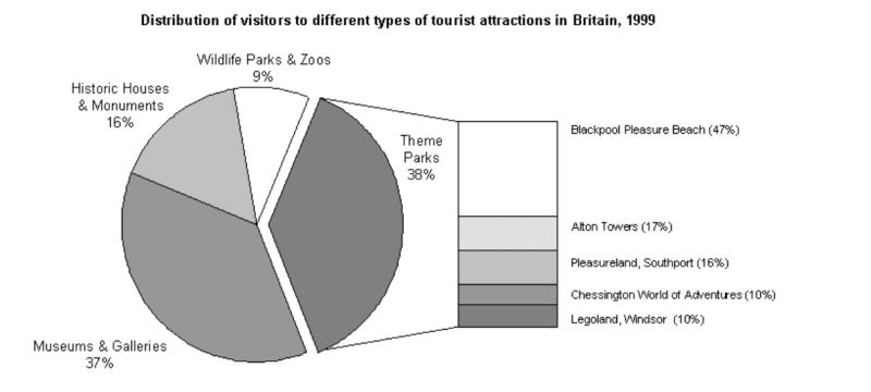
The chart below shows the results of a survey of people who visited four types of tourist attraction in Britain in the year 1999...
…
The pie chart compares figures for visitors to four categories of tourist attraction and to five different theme parks in Britain in 1999.
It is clear that theme parks and museums / galleries were the two most popular types of tourist attraction in that year. Blackpool Pleasure Beach received by far the highest proportion of visitors in the theme park sector.
Looking at the information in more detail, we can see that 38% of the surveyed visitors went to a theme park, and 37% of them went to a museum or gallery. By contrast, historic houses and monuments were visited by only 16% of the sample, while wildlife parks and zoos were the least popular of the four types of tourist attraction, with only 9% of visitors.
In the theme park sector, almost half of the people surveyed (47%) had been to Blackpool Pleasure Beach. Alton Towers was the second most popular amusement park, with 17% of the sample, followed by Pleasureland in Southport, with 16%. Finally, Chessington World of Adventures and Legoland Windsor had each welcomed 10% of the surveyed visitors.
(181 words)
Pie chart without numbers
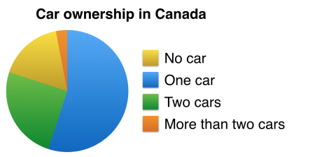
The chart below shows the proportions of adults in Canada who own one car, two cars, more than two cars, or who do not own a car.
Would it still be possible to describe the pie chart above, even though the figures are missing? (Note: this is just a quick example, not a real question)
We can describe a pie chart even if the numbers are not shown. Here are some example sentences:
- Just over half of all adults in Canada own one car.
- Roughly 50% of Canadian adults own one car, while approximately 25% of adults in Canada own two cars.
- Less than a quarter of Canadians do not own a car.
- Only a very small percentage (under 5%) of Canadian adults own more than two cars.
Remember: the full pie is always 100%, so it’s easy for us to guess approximate proportions.
Stacked bar chart
The chart below shows the amount of time that 10 to 15-year-olds spend chatting on the Internet and playing on games consoles on an average school day in the UK...
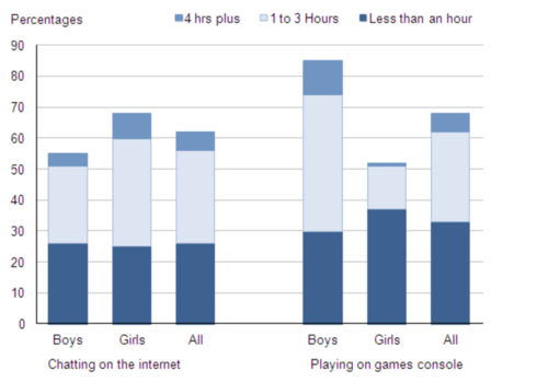
Before we write a description of this chart, here are a few quick questions:
- Which activity is most popular overall?
- What differences can you see between boys’ and girls’ habits?
- What is the total figure for boys who play on games consoles?
- What proportion of girls chat on the Internet for 4 hours or more?
Introduction
The bar chart compares the time spent by 10 to 15-year-olds in the UK on two activities, namely chatting online and playing computer games.
Overview
Overall, we can see that playing computer games is marginally more popular than chatting on the Internet. However, completely different trends can be seen if we look at the specific figures for boys and girls.
Detail paragraphs
Boys aged between 10 and 15 clearly favour playing on games consoles over chatting online. According to the chart, while 85% of boys play computer games every day, only 55% chat online daily. Furthermore, the majority of boys play on their consoles for more than one hour each day, and 10% do this activity for four hours or more.
By contrast, girls prefer chatting online. Close to 70% of 10 to 15-year-old girls engage in online conversation each day, compared to about 50% of this cohort who play computer games. Of the girls who do play on consoles, most of them play for less than an hour, whereas most girls who chat online do so for more than one hour, and nearly 10% chat for four hours or more.
Note:
In this example answer, the writer writes about boys in one paragraph and girls in the other. However, it would also be fine to write paragraphs about chatting on the Internet and playing on consoles.
Pie chart and table
If you get a question like this one from Cambridge IELTS book 8, you don’t need to worry about comparing the two charts. Just describe them separately:
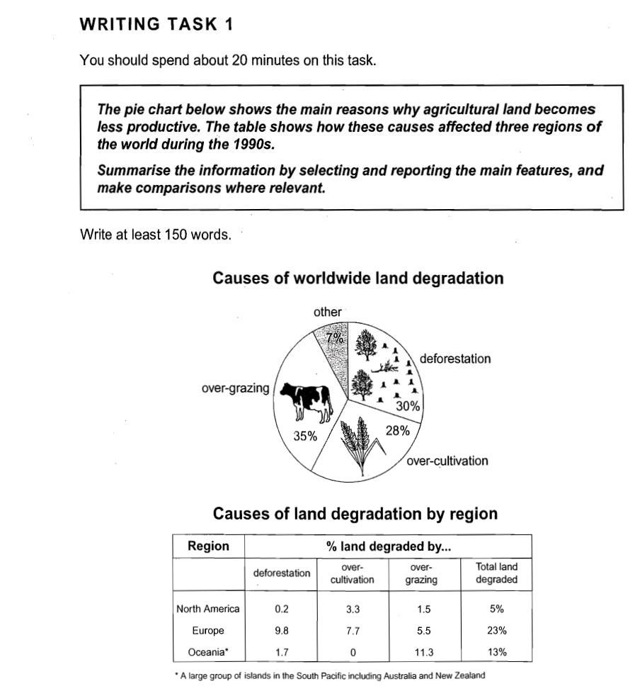
- Introduction: paraphrase the question statement
- Overview: write one general sentence about the pie chart, and one about the table
- Details: describe the pie chart
- Details: describe the table
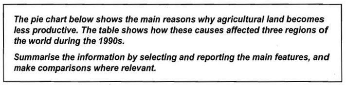
Here’s an example ‘overview’. The writer writes a separate sentence about each chart and paraphrases several of the words from the question.
Overview (paragraph 2):
It is clear from the pie chart that there are three principal reasons why farmland becomes degraded, and over-grazing is the main one. The table shows that Europe had a far higher proportion of unproductive land than Oceania or North America in the 1990s.
Task: Find the examples of paraphrasing in the paragraph above.
The easiest way to write task 1 introduction is by paraphrasing the task statement. Try to write one good sentence that paraphrases the task statement.
Example 1:
The chart below shows the value of one country’s exports in various categories during 2015 and 2016. The table shows the percentage change in each category or exports in 2016 compared with 2015.
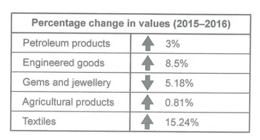
Let’s try to paraphrase this in just one sentence:
The bar chart and table give information about a country’s export earnings from five groups of products in 2015 and 2016.
Note:
– “give information about” is a good phrase when we have two related charts.
– Try to make your introduction concise rather than complicated.
Example 2:
The chart below shows how frequently people in the USA ate in fast food restaurants between 2003 and 2013.
When writing your task 1 introduction, there are two types of paraphrasing that you can use:
- “Word by word” paraphrasing: Use the task statement (from the question paper) as your template. Change the main words but keep the same sentence structure.
- “Loose” paraphrasing: Rewrite the task statement in a completely different way, making sure that the overall message is still correct.
Let’s have a look at how we might paraphrase the task statement below using these two methods.
Task statement
The chart below shows how frequently people in the USA ate in fast food restaurants between 2003 and 2013.
- Word by word paraphrasing
The bar chart illustrates the frequency with which Americans ate in fast food establishments from 2003 to 2013.
- Loose paraphrasing
The bar chart gives information about fast food eating habits in the US over a 10-year period.
The first method ensures that we include all of the information, but the resulting sentence might seem a little ‘forced’.
The second method is less precise (we haven’t mentioned frequency or restaurants). However, we have shown that we don’t need to copy the task statement, and the sentence might seem a bit more ‘natural’.
Both methods are equally acceptable. The best introduction is a paraphrase that sounds natural and still maintains the original message/information.
Example 3:
The chart below compares levels of recycling, as well as some less environmentally friendly forms of waste management, in fifteen European countries.
.png)
Here are some suggestions for paraphrasing:
- The chart compares = The bar chart shows
- levels of recycling = the percentage of waste that is recycled
- less environmentally friendly forms of waste management = put into landfill, incinerated, or disposed of in other ways
- in fifteen European countries = in various EU countries
Use the suggestions above to make a new introduction sentence.
Example 4:
The bar chart below shows the proportions of English men and women of different ages who were living alone in 2011. The pie chart compares the numbers of bedrooms in these one-person households.
Living alone in England by age and gender, 2011
Number of bedrooms in one-person households (England, 2011)
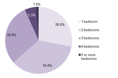
It’s also alright to write a two-sentence introduction as in the example below if there’s a lot of different information to introduce.
The question statement:
The bar chart below shows the proportions of English men and women of different ages who were living alone in 2011. The pie chart compares the numbers of bedrooms in these one-person households.
A two-sentence introduction:
The two charts give information about single-occupant households in England in the year 2011. The bar chart compares figures for occupants’ age and gender, and the pie chart shows data about the number of bedrooms in these homes.
Mistakes in the introduction
Teachers can give students this type of exercise: correct their own or somebody else’s writing of the introduction.
Can you find and correct the mistakes in each of the introductions below? Why do you think people make mistakes in their introductions?
- The bar chart illustrates that the trend of call types in the united kingdom for 8 years from 1995 to 2002.
- The bar chart compares the figures in terms of minutes spent on telephone calls, splitted into three types.
- The bar chart gives information about telephone calls. It is in three types Local, National & International and Mobile call minutes from year 1995 to 2002 in UK.
- The graph compares the total using time of 3 call types in the UK over a 7-year period from 1995.
- The bar chart presents the amount of phone calls in billion of minutes make in the UK over a period of seven years into the categories of local, national/international and mobile phone calls.
Here are suggestions for correction:
- The bar chart illustrates trends in different types of phone call in the United Kingdom over 8 years from 1995 to 2002.
- The bar chart compares figures for UK phone calls in terms of minutes spent on three types of call (between1995 and 2002).
- The bar chart gives information about three types of telephone call, namely local, national/international and mobile calls, in the UK between 1995 and 2002.
- The chart compares the total number of minutes of three types of phone call made in the UK over a 7-year period from 1995.
- The bar chart shows the amount of time spent on three types of phone call, in billions of minutes, in the UK over a period of seven years.
The main problem seems to be that people are making the sentence too ‘difficult’. To avoid mistakes, keep your introduction simple, for example:
The bar chart compares the amount of time spent by people in the UK on three different types of phone call between 1995 and 2002.
B. DIAGRAMS
IELTS Writing Task 1: always the same method
Students worry about how to describe diagrams, but the basic method is always the same: introduction, summary of main points, specific details.
Look at the following questions for example:
Example 1:
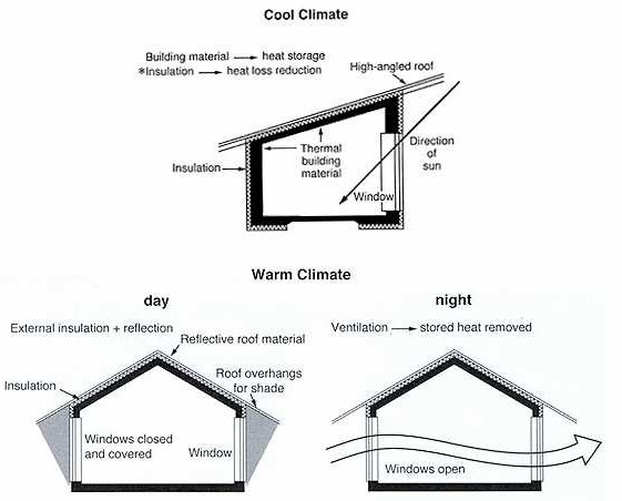
The diagrams below show some principles of house design for cool and for warm climates.
Although this question is different from the normal graph/chart questions, you should structure your answer in the same way. Try to write 4 paragraphs:
- Introduction:paraphrase the question.
- Summary:describe the main differences – the design of the roof and windows, and the use of insulation.
- Details:compare the roof design and use of insulation.
- Details:compare the window design and how windows are used during the day and at night.
Sample answer:
The diagrams show how house designs differ according to climate.
The most noticeable difference between houses designed for cool and warm climates is in the shape of the roof. The designs also differ with regard to the windows and the use of insulation.
We can see that the cool climate house has a high-angled roof, which allows sunlight to enter through the window. By contrast, the roof of the warm climate house has a peak in the middle and roof overhangs to shade the windows. Insulation and thermal building materials are used in cool climates to reduce heat loss, whereas insulation and reflective materials are used to keep the heat out in warm climates.
Finally, the cool climate house has one window which faces the direction of the sun, while the warm climate house has windows on two sides which are shaded from the sun. By opening the two windows at night, the house designed for warm climates can be ventilated.
(162 words, band 9)
Example 2:
(Cambridge IELTS Book 12)
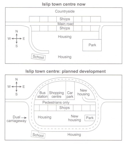
The diagrams illustrate some proposed changes to the central area of the town of Islip.
It is clear that the principal change to the town will be the construction of a ring road around the centre. Various other developments with regard to shops and housing will accompany the building of this road.
Looking at the map of Islip as it is now, we can see that a main road runs through its centre from east to west. The second map shows the planned pedestrianisation of this road. Traffic will be diverted on to a dual carriageway that will form a ring around the town centre.
Currently there is a row of shops along either side of the main road. However, it appears that the shops along the north side of the new pedestrian street will be demolished to make way for a bus station, shopping centre, car park and new housing area. The shops along the south side of the street will remain, but it seems that the town’s park will be reduced in size so that more new houses can be built within the ring road.
(187 words, band 9)
Analysis:
- How many sentences are there in each paragraph?
- What examples of paraphrasing can you find?
- What connection can you see between the two sentences in paragraph 2 and the information in paragraphs 3 and 4?
- Which verb tenses were used in the answer? Give examples.
- How did the use of directions (north, south, east, west) help the description?
- Can you find any examples of ‘cohesive devices’ (linking)?
- Can you find any ‘comparison’ language?
- Are there any examples of ‘less common’ vocabulary?
Structure: 4 paragraphs, 9 sentences in total
The introduction paraphrases the question:
- the maps below show → the diagrams illustrate
- the centre of a small town called → the central area of the town of
- as it is now, and plans for its development → some proposed changes
The overview contains two sentences that describe two main points:
- The main change: a ring road
- Other changes to shops and housing
Paragraph 3 describes changes to roads.
Paragraph 4 describes all other changes.
Vocabulary and Grammar
Here are some useful phrases from the answer:
- some proposed changes to
- the principal change will be
- the construction of a ring road
- various other developments
- will accompany the building of
- a main road runs through
- from east to west
- the planned pedestrianisation
- traffic will be diverted
- that will form a ring around
- a row of shops
- it appears that
- along the north side
- will be demolished
- to make way for
- will remain
- will be reduced in size
- can be built within the ring road
- proposed changes
- central area
- the principal change
- ring road
- main road
- runs through
- the planned pedestrianisation
- diverted traffic / to divert traffic
- dual carriageway
- form a ring
- town centre
- row of shops
- along either side of
- pedestrian street
- to make way for
- bus station, shopping centre, car park, housing area
- reduced in size
A good way to write the main body (paragraphs 3 and 4) in your task 1 answer is by developing the two ideas that you wrote in the overview (paragraph 2).
The diagrams illustrate some proposed changes to the central area of the town of Islip.
It is clear that the principal change to the town will be the construction of a ring road around the centre. Various other developments with regard to shops and housing will accompany the building of this road.
Looking at the map of Islip as it is now, we can see that a main road runs through its centre from east to west. The second map shows the planned pedestrianisation of this road. Traffic will be diverted on to a dual carriageway that will form a ring around the town centre.
Currently there is a row of shops along either side of the main road. However, it appears that the shops along the north side of the new pedestrian street will be demolished to make way for a bus station, shopping centre, car park and new housing area. The shops along the south side of the street will remain, but it seems that the town’s park will be reduced in size so that more new houses can be built within the ring road.
The first sentence of the overview (green) is developed in paragraph 3, and the second sentence of the overview (blue) is described in more detail in paragraph 4.
Tip: Try reading all of the ‘green’ sentences together, then read the ‘blue’ sentences separately. This should help you to see how the overview and main paragraphs are connected.
Practice:
Think about how you would write your answer.
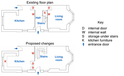
The diagrams below show the existing ground floor plan of a house and a proposed plan for some building work.
Summarise the information by selecting and reporting the main features, and make comparisons where relevant.
The maps below show the centre of a small town called Islip as it is now, and plans for its development.
Process diagrams show how something is done or made. They always show steps/stages. Here’s some advice about how to describe them:
- Try to write 4 paragraphs – introduction, summary of main points, 2 detail
- Write the introduction by paraphrasing the question (rewrite it by changing some of the words).
- For your summary, first say how many steps there are in the process. Then say where/how the process begins and ends (look at the first and last stages).
- In paragraphs 3 and 4, describe the process step by step. Include the first and last steps that you mentioned in the summary, but try to describe them in more detail or in a different
- You could describe the steps in one paragraph, but it looks more organised if you break the description into two paragraphs. Just start paragraph 4 somewhere in the middle of the
- Mention every stage in the
- Use ‘sequencing’ language e.g. at the first / second / following / final stage of the process, next, after that, then, finally
- Times (e.g. past dates) are not usually shown, so use the present simple
- It’s usually a good idea to use the passive e.g. ‘At the final stage, the product is delivered to shops’ (because we don’t need to know who delivered the product)
Example 1:
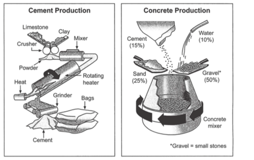
The diagrams below show the stages and equipment used in the cement-making process, and how cement is used to produce concrete for building purposes.
Introduction and overview:
The first diagram illustrates the process of cement manufacture, and the second diagram shows the materials that go into the production of concrete.
It is clear that there are five stages in the production of cement, beginning with the input of raw materials and ending with bags of the finished product. To produce concrete, four different materials are mixed together.
Details paragraphs:
Looking at the ‘cement process’ diagram below, let’s think about the verbs that we’ll need to use. There are various options.
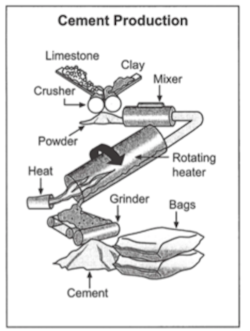
Let’s start with the 5 nouns that mark the 5 stages of this process:
crusher, mixer, heater, grinder, bags
We can convert these nouns into passive verb forms:
- Limestone and clay are crushed.
- The resulting powder is mixed.
- It is heated.
- Then it is ground.
- The final product, cement, is bagged.
Or we can keep the original nouns, and use active or passive verbs:
- Limestone and clay are placed in a crusher. (passive)
- The resulting powder goes into a mixer. (active)
- It then passes through a rotating heater. (active)
- The heated mixture is put into a grinder. (passive)
- The cement is packaged in large bags. (passive)
Of course, the best approach is to use a mix of the above options:
At the first stage in the production of cement, limestone and clay are crushed to form a powder. This powder is then mixed before it passes into a rotating heater. After heating, the resulting mixture is ground, and cement is produced, Finally, the cement is put in large bags.
Here’s a full sample answer for the process diagram task above.
The first diagram illustrates the process of cement manufacture, and the second diagram shows the materials that go into the production of concrete.
It is clear that there are five stages in the production of cement, beginning with the input of raw materials and ending with bags of the finished product. To produce concrete, four different materials are mixed together.
At the first stage in the production of cement, limestone and clay are crushed to form a powder. This powder is then mixed before it passes into a rotating heater. After heating, the resulting mixture is ground, and cement is produced. Finally, the cement is packaged in large bags.
Cement is one of the four raw materials that are used in the production of concrete, along with gravel, sand and water. To be exact, concrete consists of 50% gravel, 25% sand, 15% cement and 10% water. All four materials are blended together in a rotating machine called a concrete mixer.
Example 2:
The diagram below shows the life cycle of a salmon, from egg to adult fish.
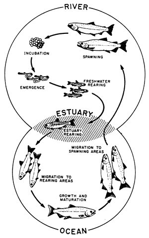
How do you write an overview or summary about a ‘life cycle’ diagram? Here are two things that you can do:
- Count the number of stages in the life cycle.
- Decide on a beginning and an end point in the cycle.
So here’s a possible overview paragraph for the task:
According to the diagram, there are eight main stages as the salmon develops from egg to mature adult. Salmon travel to three different places during the cycle, moving from river to estuary to ocean and back.
You can write your description of the diagram by answering the following questions:
- Where and in what form do salmon begin their lives?
- When the young salmon emerge from eggs, where are they reared?
- Before swimming to the ocean, where do the young fish migrate to?
- What happens to salmon during their time in the ocean?
- Where do the adult fish then travel to, and why?
- What happens that completes the cycle?
Here’s a full sample answer:
The diagram illustrates the stages in the life of the salmon, from birth to maturity.
It is clear that there are six main stages as the salmon develops from egg to mature adult. We can also see that salmon spend time in three distinct locations during the cycle, moving from river to estuary to ocean and then back upstream.
Salmon begin their lives in rivers where the adult fish lay and incubate their eggs. After emerging from eggs, the young salmon spend the next stage of their lives being reared in freshwater areas. Then, at some point in their development, the fish swim downstream to river estuaries where rearing continues.
Following the estuary rearing period, the maturing salmon migrate to the ocean, where they eventually become fully grown adults. Finally, the adult fish travel back upstream to spawning areas of rivers; here they reproduce and lay their eggs, and the life cycle begins anew.
(154 Words, band 9)
Example 3:
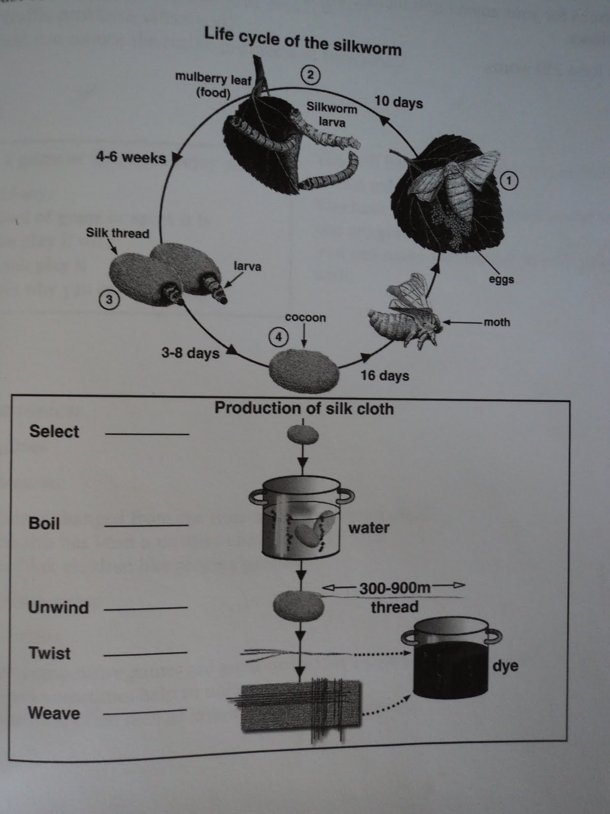
Here’s a full sample answer:
The diagrams illustrate the stages in the life of a silkworm and the process of producing silk cloth.
There are four main stages in the life cycle of the silkworm, from eggs to adult moth. The process of silk cloth production involves six steps, from silkworm cocoon to silk material.
At the first stage in the life cycle of a silkworm, the moth lays its eggs. Around ten days later, silkworm larvae hatch from the eggs; these larvae feed on mulberry leaves. Then, after four to six weeks, the larvae become covered in silk thread, and it takes between three and eight days for a full cocoon to be produced.
For silk cloth production, a cocoon is first selected and then boiled in water. After boiling, the silk thread that makes up the cocoon is unwound, and then several strands of thread are twisted together. At the fifth and sixth stages in the process, the thread can either be dyed and then woven into silk fabric, or it can be woven first and then dyed subsequently.
(176 words, band 9)
0