

IELTS Writting Task 1 - Appendix II - Question type
July 1,2025
root
9. Maps
The graph below gives information about car ownership in Britain from 1971 to 2007.
Model answer:
The graph shows changes in the number of cars per household in Great Britain over a period of 36 years.
Overall, car ownership in Britain increased between 1971 and 2007. In particular, the percentage of households with two cars rose, while the figure for households without a car fell.
In 1971, almost half of all British households did not have regular use of a car. Around 44% of households had one car, but only about 7% had two cars. It was uncommon for families to own three or more cars, with around 2% of households falling into this category.
The one-car household was the most common type from the late 1970s onwards, although there was little change in the figures for this category. The biggest change was seen in the proportion of households without a car, which fell steadily over the 36-year period to around 25% in 2007. In contrast, the proportion of two-car families rose steadily, reaching about 26% in 2007, and the proportion of households with more than two cars rose by around 5%.
Analysis
Structure: 4 paragraphs, 9 sentences in total
The introduction paraphrases the question:
- gives information about → shows changes in
- car ownership → the number of cars per household
- from 1971 to 2007 → over a period of 36 years
The overview contains two sentences that describe three main points:
- Total car ownership increased.
- The percentage of two-car households rose.
- The percentage of no-car households fell.
Paragraph 3 compares all of the categories in the first year shown: 1971.
Paragraph 4 describes changes in the figures for each category, with a focus on the final year shown: 2007.
The chart below shows how frequently people in the USA ate in fast food restaurants between 2003 and 2013
.
Model answer:
The bar chart illustrates the frequency with which Americans ate in fast food establishments from 2003 to 2013.
It is clear that the majority of Americans ate in fast food restaurants between once a week and once a month in all three years. We can also see a shift towards eating in these restaurants less frequently by the end of the 10-year period.
In each of the years shown on the chart, close to 60% of people in the US ate in fast food restaurants between once and four times a month. Roughly 15 to 20% of Americans reported eating in fast food outlets several times per week, while 3 to 4% of people ate in these outlets daily. At the other end of the scale, around 4% of people avoided fast food restaurants completely.
Between 2006 and 2013, the total proportion of Americans who ate in fast food establishments either once a week or several times a week fell by almost 10%. At the same time, there was an increase of around 8% in the ‘once or twice a month’ category. In other words, the weekly fast food habit that was common in 2003 and 2006 became a monthly or twice monthly habit in 2013.
Taken from Cambridge IELTS book 12
Analysis
Structure: 4 paragraphs, 9 sentences in total
The introduction paraphrases the question:
- the chart below shows → the bar chart illustrates
- how frequently people in the USA → the frequency with which Americans
- fast food restaurants → fast food establishments
- between… and… → from… to…
The overview contains two sentences that describe two main points:
- The two categories with the highest percentages overall
- A change over the 10-year period
Paragraph 3 compares average percentages for each frequency category, without looking at individual years.
Paragraph 4 looks at changing trends: differences in the figures over the 10-year period.
IELTS Writing Task 1: ‘hospital attendances’ bar chart
The chart below shows figures for attendances at hospital emergency care departments in Northern Ireland by age group in December 2016 and December 2017.
Attendances at emergency care departments per 1000-population
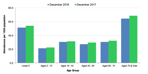
(Source: health-ni.gov.uk)
IELTS Writing Task 1: ‘hospital attendances’ answer
This is my sample description of the bar chart that you can see here:
The bar chart compares the number of visits made by people in six age categories to hospital emergency wards in Northern Ireland in the December of 2016 and 2017.
It is clear that elderly people and the youngest children were the most frequent visitors to A&E (accident and emergency) departments. Also, there was a slight increase in the rate of emergency care attendances among all six age groups from December 2016 to December 2017.
Looking first at the older age groups, roughly 65 people, per 1000 population, aged 75 and over attended A&E wards in December 2016, and this rose to almost 70 attendances per 1000-population one year later. Interestingly, those aged 65 to 74 were less than half as likely to require emergency treatment, with around 30 attendances per 1000-population in both months.
At the other end of the age scale, the figures for A&E visits by under-5s rose marginally from around 50 to approximately 52 per 1000-population over the one-year period. Children aged 5 to 15 made the fewest visits, at just over 20 per 1000-population in both months. Finally, there was almost no difference in the figures for emergency care attendances among people aged 16 to 44, 45 to 64 and 65 to 74.
1) Phrases to begin main paragraphs
These phrases aid coherence by telling us what each paragraph is about:
- It is clear that… (overview)
- Looking first at the older age groups,…
- At the other end of the age scale,…
2) Paraphrasing of “attendances at hospital emergency care departments”
- visits made to hospital emergency wards
- visitors to A&E (accident and emergency) departments
- emergency care attendances
- attended A&E wards
- require emergency treatment
- figures for A&E visits
3) Language for comparisons
- the most frequent visitors
- less than half as likely to
- made the fewest visits
- almost no difference in the figures for
4) Language for describing changes
- there was a slight increase in
- and this rose to almost… one year later
- rose marginally from… to…
5) Giving the figures
- roughly 65 out of every 1000 people
- almost 70 attendances per 1000-population
- around 30 attendances per 1000-population
- from around 50 to approximately 52 per 1000-population
- just over 20 per 1000-population

Model answer:
The pie charts compare visitors’ responses to a survey about customer service at the Parkway Hotel in 2005 and in 2010.
It is clear that overall customer satisfaction increased considerably from 2005 to 2010. While most hotel guests rated customer service as satisfactory or poor in 2005, a clear majority described the hotel’s service as good or excellent in 2010.
Looking at the positive responses first, in 2005 only 5% of the hotel’s visitors rated its customer service as excellent, but this figure rose to 28% in 2010. Furthermore, while only 14% of guests described customer service in the hotel as good in 2005, almost three times as many people gave this rating five years later.
With regard to negative feedback, the proportion of guests who considered the hotel’s customer service to be poor fell from 21% in 2005 to only 12% in 2010. Similarly, the proportion of people who thought customer service was very poor dropped from 15% to only 4% over the 5-year period. Finally, a fall in the number of ‘satisfactory’ ratings in 2010 reflects the fact that more people gave positive responses to the survey in that year.
Analysis
Structure: 4 paragraphs, 8 sentences in total
The introduction paraphrases the question:
- The charts show → The pie charts compare
- results of a questionnaire that asked visitors → visitors’ responses to a survey
- how they rated the hotel’s customer service → a survey about customer service
The overview contains two sentences that describe two main points:
- The overall increase in customer satisfaction
- The opinion of most customers in 2005, compared to the majority opinion in 2010
Paragraph 3 looks at the positive responses in both years.
Paragraph 4 describes negative and satisfactory ratings in both years.
The tables below give information about sales of Fairtrade*-labelled coffee and bananas in 1999 and 2004 in five European countries.
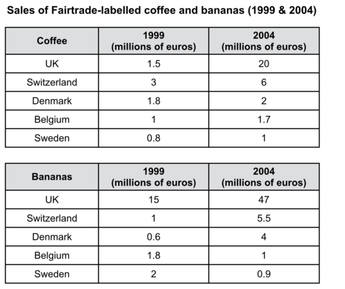
Taken from Cambridge IELTS book 10
Model answer:
The tables show the amount of money spent on Fairtrade coffee and bananas in two separate years in the UK, Switzerland, Denmark, Belgium and Sweden.
It is clear that sales of Fairtrade coffee rose in all five European countries from 1999 to 2004, but sales of Fairtrade bananas only went up in three out of the five countries. Overall, the UK saw by far the highest levels of spending on the two products.
In 1999, Switzerland had the highest sales of Fairtrade coffee, at €3 million, while revenue from Fairtrade bananas was highest in the UK, at €15 million. By 2004, however, sales of Fairtrade coffee in the UK had risen to €20 million, and this was over three times higher than Switzerland’s sales figure for Fairtrade coffee in that year. The year 2004 also saw dramatic increases in the money spent on Fairtrade bananas in the UK and Switzerland, with revenues rising by €32 million and €4.5 million respectively.
Sales of the two Fairtrade products were far lower in Denmark, Belgium and Sweden. Small increases in sales of Fairtrade coffee can be seen, but revenue remained at €2 million or below in all three countries in both years. Finally, it is noticeable that the money spent on Fairtrade bananas actually fell in Belgium and Sweden.
Analysis
Structure: 4 paragraphs, 9 sentences in total
The introduction paraphrases the question:
- the tables below give information about → the tables show
- sales of → the amount of money spent on
- in 1999 and 2004 → in two separate years
- in five European countries → in the UK, Switzerland, Denmark, Belgium and Sweden
The overview contains two sentences that describe three main points:
- Sales of coffee rose in all five countries.
- Sales of bananas rose in three countries.
- The UK had the highest overall spending on both products.
Paragraph 3 focuses on the UK and Switzerland, because these two countries had the highest sales figures.
Paragraph 4 describes the three countries with the lowest sales figures.
The chart below shows the value of one country’s exports in various categories during 2015 and 2016. The table shows the percentage change in each category or exports in 2016 compared with 2015.
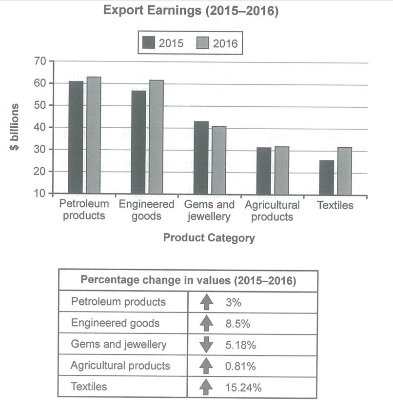
(Source: Cambridge IELTS 14)
Model answer:
The bar chart and table give information about a country’s export earnings from five groups of products in 2015 and 2016.
It is noticeable that export revenues in all but one of the five product categories increased over the period shown. While petroleum products were the highest earning exports in both years, the textile industry saw the most significant growth in earnings.
Export earnings from petroleum products rose from around $61 billion in 2015 to $63 billion in 2016, which was an increase of 3%. Income from engineered goods reached a similar level. The country’s export earnings from these goods went up by 8.5% to approximately $62 billion in 2016.
From 2015 to 2016, there was a 15.24% increase in export revenue from textiles, with earnings rising from roughly $25 billion to over $30 billion. By contrast, there was almost no change in the amount of money earned from agricultural products, which remained at just over $30 billion. Finally, the only decline in income occurred in the gems and jewellery product group, where export earnings fell by around 5% to approximately $40 billion in 2016.
IELTS Writing Task 1: ‘age distribution’ answer
Here’s my full report for the question below. I found this one difficult, so don’t worry if you did too!
The charts below compare the age structure of the populations of France and India in 1984.
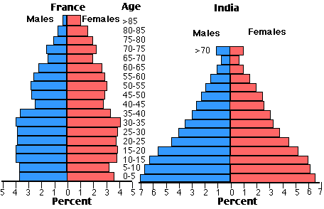
The two charts compare the populations of France and India in terms of age distribution by gender in the year 1984.
It is clear that the population of India was younger than that of France in 1984, with a noticeably larger proportion of people aged under 20. France, on the other hand, had a significantly larger percentage of elderly inhabitants.
In India, close to 14% of people were aged 5 or under, and each five-year age bracket above this contained an increasingly smaller proportion of the population. France’s population, by contrast, was more evenly distributed across the age ranges, with similar figures (around 7% to 8% of all people) for each five-year cohort between the ages of 0 and 40. Somewhere between 10% and 15% of all French people were aged 70 or older, but the equivalent figure for India was only 2%.
Looking more closely at gender, there was a noticeably higher proportion of French women than men in every cohort from age 50 upwards. For example, almost 3% of French 70- to 75-year-olds were women, while just under 2% were men. No significant gender differences can be seen on the Indian population chart.
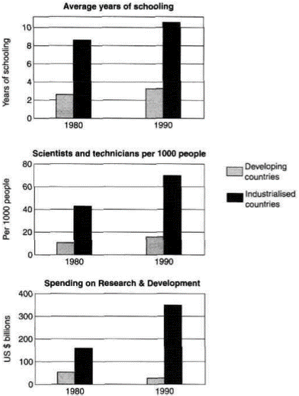
Model answer:
The three bar charts show average years of schooling, number of scientists and technicians, and research and development spending in developing and developed countries. Figures are given for 1980 and 1990.
It is clear from the charts that the figures for developed countries are much higher than those for developing nations. Also, the charts show an overall increase in participation in education and science from 1980 to 1990.
People in developing nations attended school or an average of around 3 years, with only a slight increase in years of schooling from 1980 to 1990. On the other hand, the figure for industrialised countries rose from nearly 9 years of schooling in 1980 to nearly 11 years in 1990.
From 1980 to 1990, the number of scientists and technicians in industrialised countries almost doubled to about 70 per 1000 people. Spending on research and development also saw rapid growth in these countries, reaching $350 billion in 1990. By contrast, the number of science workers in developing countries remained below 20 per 1000 people, and research spending fell from about $50 billion to only $25 billion.
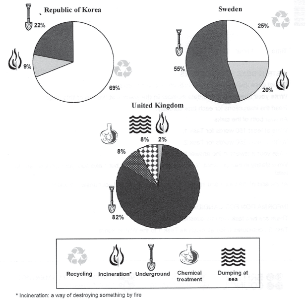
The pie charts below show how dangerous waste products are dealt with in three countries.
Model answer:
The charts compare Korea, Sweden and the UK in terms of the methods used in each country to dispose of harmful waste.
It is clear that in both the UK and Sweden, the majority of dangerous waste products are buried underground. By contrast, most hazardous materials in the Republic of Korea are recycled.
Looking at the information in more detail, we can see that 82% of the UK’s dangerous waste is put into landfill sites. This disposal technique is used for 55% of the harmful waste in Sweden and only 22% of similar waste in Korea. The latter country recycles 69% of hazardous materials, which is far more than the other two nations.
While 25% of Sweden’s dangerous waste is recycled, the UK does not recycle at all. Instead, it dumps waste at sea or treats it chemically. These two methods are not employed in Korea or Sweden, which favour incineration for 9% and 20% of dangerous waste respectively.
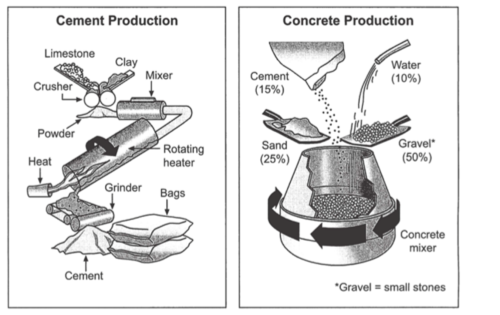
The diagrams below show the stages and equipment used in the cement-making process, and how cement is used to produce concrete for building purposes.
Taken from Cambridge IELTS book 8
Model answer:
The first diagram illustrates the process of cement manufacture, and the second diagram shows the materials that go into the production of concrete.
It is clear that there are five stages in the production of cement, beginning with the input of raw materials and ending with bags of the finished product. To produce concrete, four different materials are mixed together.
At the first stage in the production of cement, limestone and clay are crushed to form a powder. This powder is then mixed before it passes into a rotating heater. After heating, the resulting mixture is ground, and cement is produced. Finally, the cement is packaged in large bags.
Cement is one of the four raw materials that are used in the production of concrete, along with gravel, sand and water. To be exact, concrete consists of 50% gravel, 25% sand, 15% cement and 10% water. All four materials are blended together in a rotating machine called a concrete mixer.
Analysis
Structure: 4 paragraphs, 10 sentences in total
The introduction paraphrases the question:
- the diagrams below show → the first diagram illustrates… and the second diagram shows
- the stages and equipment used in the cement-making process → the process of cement manufacture
- how cement is used to produce concrete → the materials that go into the production of concrete
The overview contains two sentences that describe two main points:
- The number of stages in the production of cement
- The number of materials that are mixed to produce concrete
Paragraph 3 describes stages in the cement-making process.
Paragraph 4 describes the mixing of raw materials to make concrete.
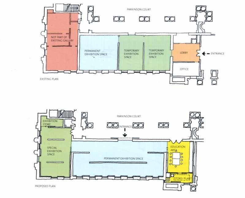
Here’s my advice:
- Introduction: paraphrase the question
- Summary: the main changes to the gallery (entrance and use of space)
- Paragraph comparing entrance, lobby, office, education area
- Paragraph comparing use of space for exhibitions
Model answer:
The first picture shows the layout of an art gallery, and the second shows some proposed changes to the gallery space.
It is clear that significant changes will be made in terms of the use of floor space in the gallery. There will be a completely new entrance and more space for exhibitions.
At present, visitors enter the gallery through doors which lead into a lobby. However, the plan is to move the entrance to the Parkinson Court side of the building, and visitors will walk straight into the exhibition area. In place of the lobby and office areas, which are shown on the existing plan, the new gallery plan shows an education area and a small storage area.
The permanent exhibition space in the redeveloped gallery will be about twice as large as it is now because it will occupy the area that is now used for temporary exhibitions. There will also be a new room for special exhibitions. This room is shown in red on the existing plan and is not currently part of the gallery.
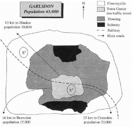
The map below is of the town of Garlsdon. A new supermarket (S) is planned for the town. The map shows two possible sites for the supermarket.
Model answer:
The map shows two potential locations (S1 and S2) for a new supermarket in a town called Garlsdon.
The main difference between the two sites is that S1 is outside the town, whereas S2 is in the town centre. The sites can also be compared in terms of access by road or rail, and their positions relative to three smaller towns.
Looking at the information in more detail, S1 is in the countryside to the north west of Garlsdon, but it is close to the residential area of the town. S2 is also close to the housing area, which surrounds the town centre.
There are main roads from Hindon, Bransdon and Cransdon to Garlsdon town centre, but this is a no traffic zone, so there would be no access to S2 by car. By contrast, S1 lies on the main road to Hindon, but it would be more difficult to reach from Bransdon and Cransdon. Both supermarket sites are close to the railway that runs through Garlsdon from Hindon to Cransdon.
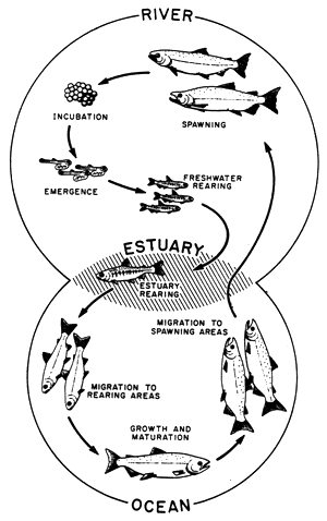
The diagram below shows the life cycle of a salmon, from egg to adult fish.
Model answer:
The diagram illustrates the stages in the life of the salmon, from birth to maturity.
It is clear that there are six* main stages as the salmon develops from egg to mature adult. We can also see that salmon spend time in three distinct locations during the cycle, moving from river to estuary to ocean and then back upstream.
Salmon begin their lives in rivers where the adult fish lay and incubate their eggs. After emerging from eggs, the young salmon spend the next stage of their lives being reared in freshwater areas. Then, at some point in their development, the fish swim downstream to river estuaries where rearing continues.
Following the estuary rearing period, the maturing salmon migrate to the ocean, where they eventually become fully grown adults. Finally, the adult fish travel back upstream to spawning areas of rivers; here they reproduce and lay their eggs, and the life cycle begins anew.
0